Introduction
SafetyIQ, Azuga's multi-TSPs (Telematics Service Providers) data analytics platform, is designed for commercial Auto Insurers, Resellers, and Enterprises to analyze fleet risk profiles. Rebranded in 2022 following its acquisition in 2021, SafetyIQ aggregates and standardizes data from over 90+ TSPs, including Geotab, Verizon, and WebFleet. This unified approach enables the TSPs customers to monitor and manage risk profiles efficiently.
Designed to support underwriters, loss control officers, claims handlers, and data scientists, SafetyIQ helps insurers assess risk, track fleet behaviors, and provide key metrics for underwriting, claims validation, and loss control.
This user manual offers a detailed overview of SafetyIQ's key features and practical applications for fleet insurance management.
Key Personas in SafetyIQ
SafetyIQ caters to four key personas in the insurance industry: Underwriters, Loss control specialists, Claims validators, and Data scientists.
Loss Control Specialist :
- Assesses fleet risk and prices insurance policies.
- Uses SafetyIQ to evaluate key variables like miles driven, parking habits, and weekend driving patterns to determine a fleet’s risk level. Based on this assessment, they can adjust policy rates or offer discounts.
- Monitors fleet activity to ensure safe driving behaviors.
- Uses SafetyIQ to identify high-risk behaviors such as frequent late-night trips or unsafe parking. They collaborate with fleet managers to address these risks before they lead to accidents or claims.
Claims Validator :
Data Scientist:
- Validates accident claims using data from crash detection modules.
- SafetyIQ provides a 360-degree view of accidents, helping claims specialists reconstruct incidents for an objective assessment, rather than relying solely on driver testimony.
- Analyses raw data from multiple telematics service providers (TSPs).
- Processes and analyzes large datasets from TSPs (e.g., Azuga, Geotab, Verizon) integrated with SafetyIQ to generate insights for underwriting and risk management.
Fleet Onboarding
Fleet Onboarding
Fleet Onboarding Overview
Before a fleet can begin using SafetyIQ, an insurance provider must first create the fleet account. This process sends an invitation to the fleet administrator, who can then register and gain access to SafetyIQ.
Steps to add new fleet:
- Log in to SafetyIQ.
- Click your Profile in the upper-right corner.
- Select Account Management.
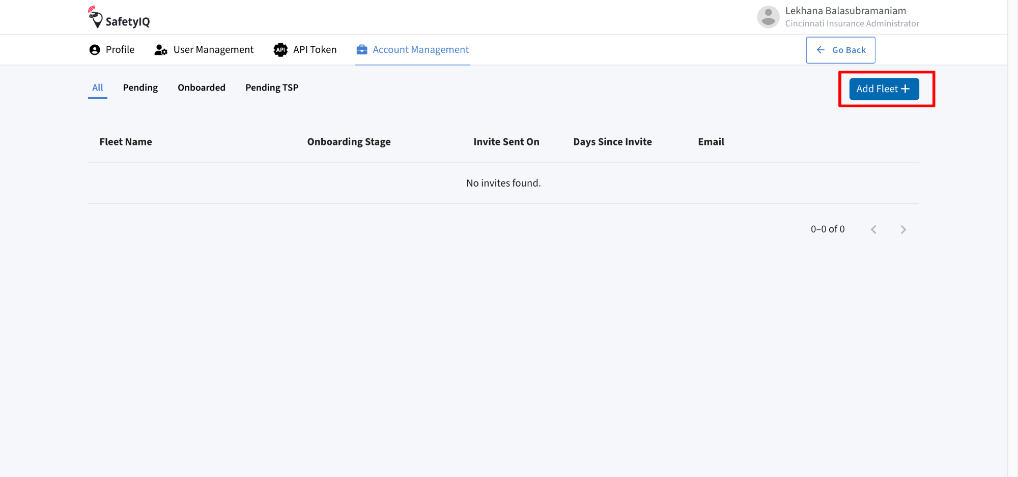
- Click on Add Fleet.
- Enter the required fleet information.
- Click Send Invite
- An invitation email is automatically sent to the Fleet Administrator.
- The Fleet Administrator completes registration using the email link.
- Once registration is complete, the fleet is added to the insurance program and becomes available within SafetyIQ.
Create New Fleet
- To onboard a new fleet:
- Log in to SafetyIQ.
- Navigate to Profile > Account Management
- Click Add Fleet.
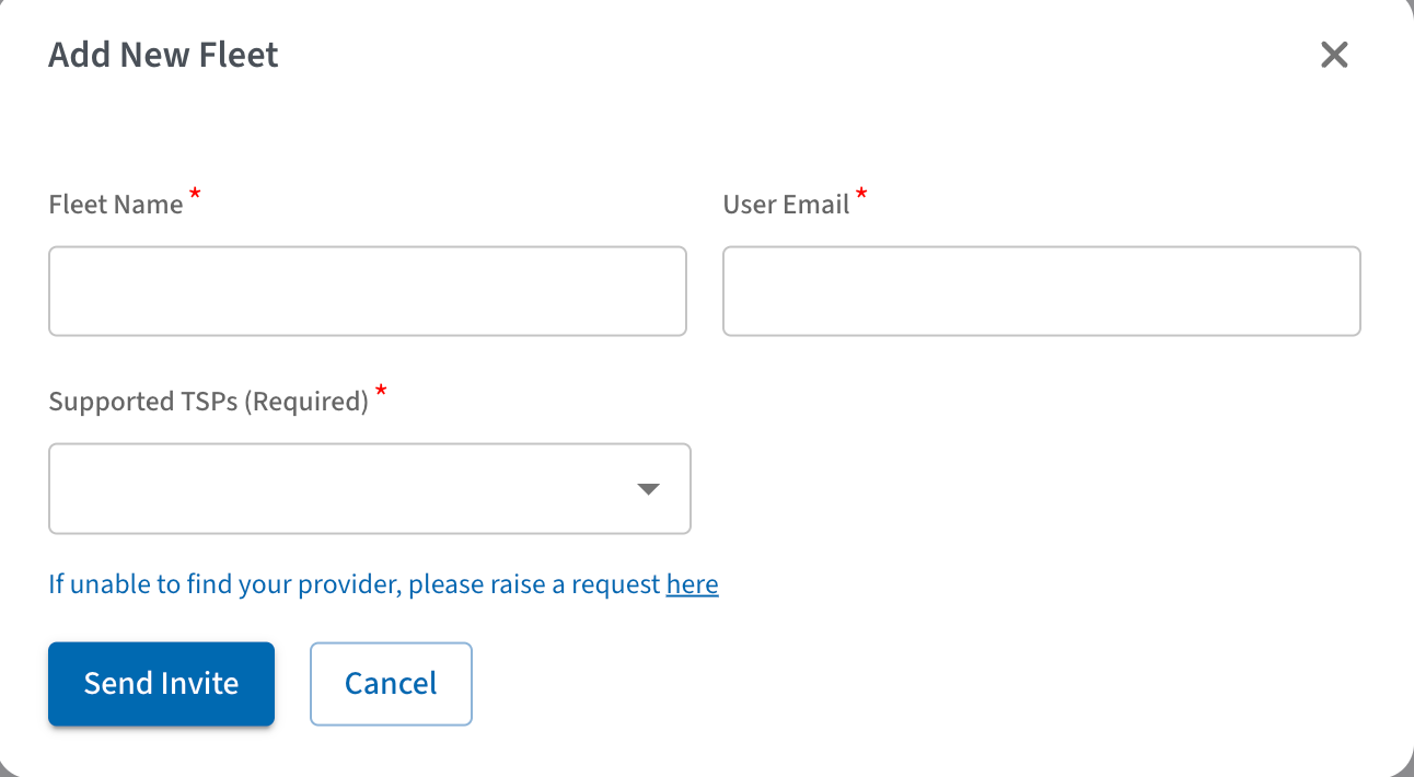
- The Add New Fleet dialog appears.
2. Enter the following information:
- Fleet Name – Name of the fleet.
- User Email – Email address of the Fleet Administrator.
- Supported TSP – Select the telematics service provider associated with the fleet.
After completing all required fields, click Send Invite.
SafetyIQ automatically creates the onboarding request and sends an invitation email to the Fleet Administrator.
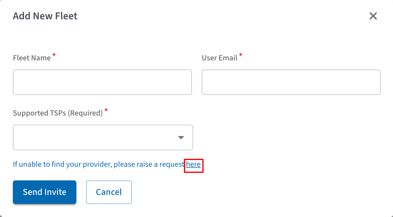
Note: If your telematics provider is unavailable in the list, click Raise a request to contact Azuga Support.
Create New Fleet (Contd)
3. Steps to a TSP (Optional):
- Raise a request by clicking on here as shown in the image
- Click on add TSP
- Enter the following information:
- TSP Name
- Website Link
- Click on Send Invite
Create New Fleet (Contd)
Track Fleet Onboarding Status:
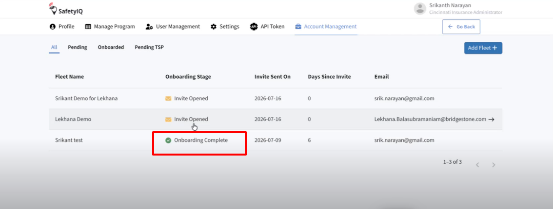
- After the invitation is sent, the fleet appears on the Account Management page.
- The Account Management table displays:
- Fleet Name
- Onboarding Stage
- Invite Sent On
- Days Since Invite Email
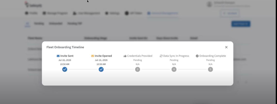
- To view the current onboarding progress, click the ellipsis icon corresponding to the fleet. This provides the real time status of the onboarding process.
Invitation Email
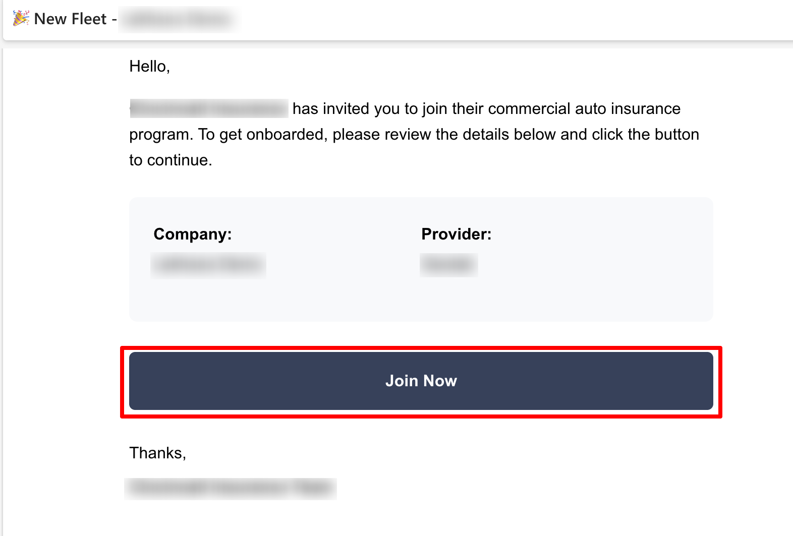
- After the invitation is sent, the designated Fleet Administrator receives an email inviting them to join the insurance program.
The invitation email contains:
- Insurance provider name
- Fleet name
- Selected telematics provider
- Join Now button
- Click Join Now to begin the fleet registration process.
- The Join Now button securely redirects the Fleet Administrator to the provider authentication page.
Authenticate and Grant consent
Authenticate and Connect the Fleet:
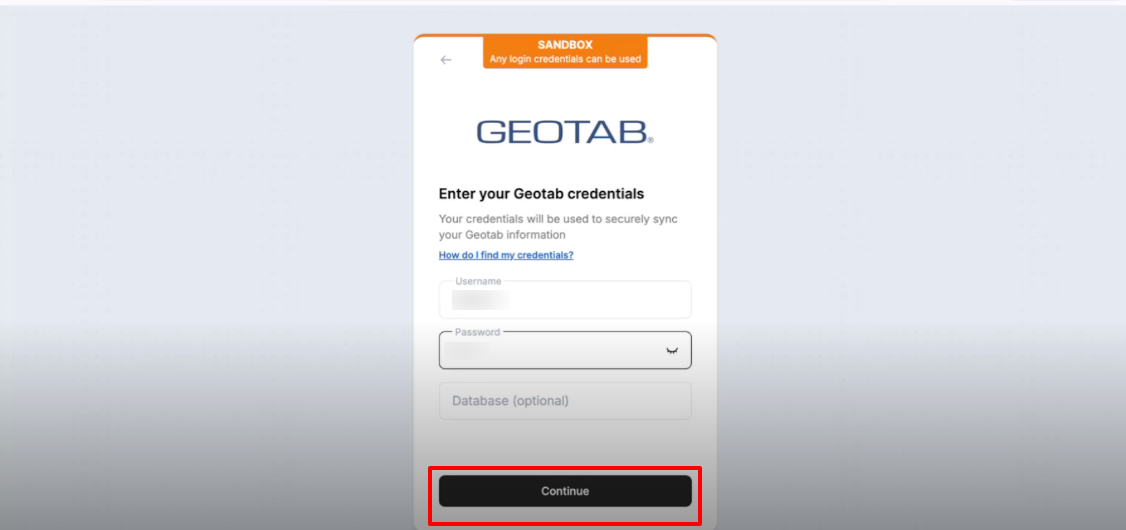
- After clicking Join Now, the Fleet Administrator is redirected to the provider authentication page.
- To complete the onboarding:
- Enter the provider credentials.
- Authenticate using the telematics provider account.
- Review the requested permissions.
- Grant consent to allow SafetyIQ to securely access the fleet information.
- Click Continue.
- Once authentication and consent are successfully completed, the fleet is securely connected to SafetyIQ.
Complete Onboarding
Fleet Successfully Onboarded:
- Once the Fleet Administrator completes authentication and grants the required permissions, the onboarding process is complete.
- The onboarding status automatically displays Onboarding Complete
- The newly onboarded fleet is automatically added to the insurance provider's account and becomes available throughout the SafetyIQ platform.
- The fleet can now be accessed from:
- Program Dashboard
- Fleet Dashboard
- From these dashboards, insurance providers can begin monitoring fleet performance, reviewing insights, and accessing SafetyIQ features.
Dashboard
Dashboard
Platform Overview
Upon logging into SafetyIQ, users are directed to the Program Dashboard within the Dashboard section, offering a holistic view of all insured fleets under a specific carrier.
Program Dashboard
The Program Dashboard offers a comprehensive view of fleet performance and risk data, consolidating key information in one interface. It enables carriers to monitor vehicle activity, assess risks, and track safety events in real time.
With intuitive visuals—including bar charts, pie charts, and heat maps—carriers can easily analyze data by region, trip type, and risk category. The dashboard simplifies fleet management by highlighting trends, mitigating risks, and enhancing overall safety across all vehicles and drivers. It helps carriers make data-driven decisions to optimize safety strategies, reduce liabilities, and improve fleet reliability.
Let’s explore the different sections of the dashboard in detail for a better understanding:
Program Dashboard
Program Summary:
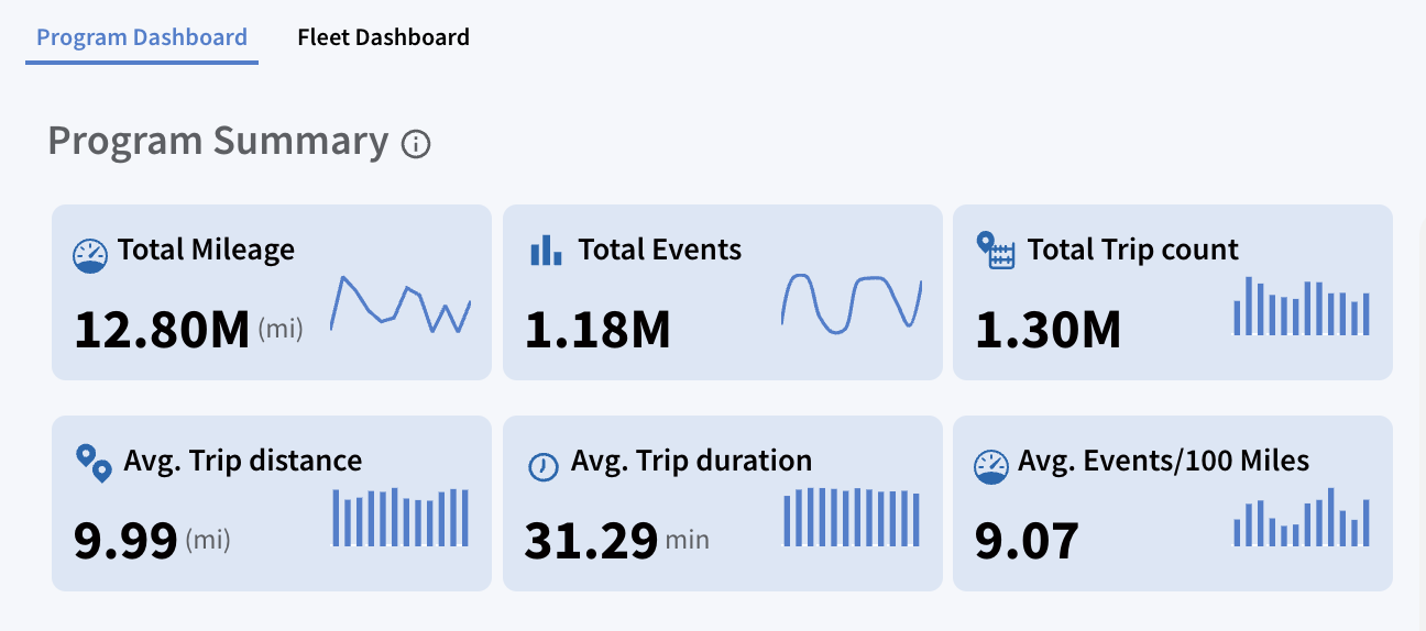
It provides a concise overview of fleet performance, highlighting key metrics and important KPIs for the telematics program over a specified period. This quick snapshot offers essential data for easy reference:
- Total Mileage:
Shows the cumulative distance travelled by all vehicles (12.80 million miles in this case).
- Total Events:
Represents the total number of significant events such as speeding or braking, etc. (1.18 million events).
- Total Trip Count:
Total number of trips completed by the fleet (1.3 million trips).
- Average Trip Distance:
Displays the average distance per trip (9.99 miles).
- Average Trip Duration:
Average time spent per trip (31.29 minutes).
- Average Events/100 Miles:
Shows the number of driving events (like harsh braking or speeding) that occur on average/100 miles (9.07 events). Carriers pay close attention to this figure, as a higher average of events/100 miles suggests a higher-risk fleet.
Additional Interactivity:
Hover Functionality: Hovering over the bars and trend graphs reveals specific data points for each month, enabling carriers to quickly evaluate monthly PI (Performance Indicators) trends and identify patterns or anomalies over time.
Customization & Reporting Option:
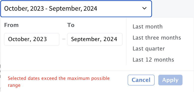
- Set Date Range: Filter the dashboard by setting a custom date range. By default, it displays data for the last 12 months on the UI, with additional options to view the last month, last three months, last quarter, or year to date. To access data older than 12 months, go to the "Historical Reports" under "Custom Analytics section”.
- Schedule Report: Set up a recurring schedule to automatically generate and send Program Dashboard reports on fleet metrics at selected intervals. Reports are sent to recipients on the 5th of every month.
- Export Page: Export the current dashboard view to save or share the data displayed on the Program Dashboard.
Account Focus:
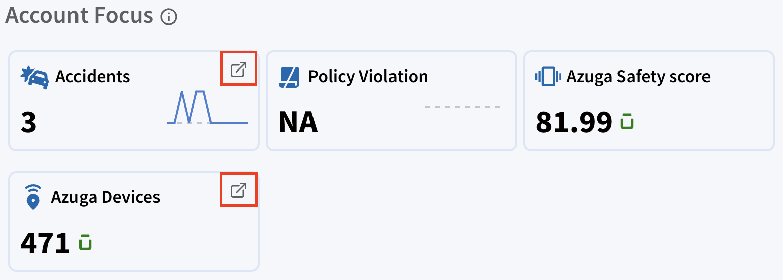
The Account Focus section provides a high-level summary of key metrics related to fleet safety and performance. This section allows users to monitor critical aspects of their fleet at a glance, enabling quick insights and decision-making.
- Accidents: Displays the total number of accidents recorded (3 accidents).
- Policy Violations: Tracks the number of violations related to driving policies (NA in this case).
- Azuga Safety Score: Represents the overall safety performance of the fleet (81.99).
- Azuga Devices: Displays the number of Azuga devices actively connected and functioning within the fleet (471 devices).
Additional Interactivity:
- Hover Functionality: Hovering over trend lines on the cards reveals specific data points for each month, enabling carriers to analyse patterns and variations.
- Arrow Buttons: Clicking the arrow buttons on the Accident and Azuga Devices cards opens their detailed data, enabling deeper analysis and informed decision-making.
Introduction to Milliman:
Milliman is a leading actuarial and data science firm recognized for its certified algorithms that evaluate fleet risk based on driving behaviors. Used by insurers in over 30+ U.S. states, the Milliman score provides a standardized risk assessment across fleets, regardless of their telematics service provider (TSP). This helps carriers make informed underwriting decisions and set appropriate pricing policies.
Milliman scores are generated on a monthly basis at the vehicle level. These individual vehicle scores are then aggregated to derive the overall fleet-level Milliman scores.
Note: In cases where a vehicle has insufficient trip data to generate a Milliman score for the month, that vehicle will not have a score for that period.
Milliman Score Distribution:
800-999:
Low Risk
500-799:
Medium Risk
0-499:
High Risk
Fleet Risk Distribution (Donut Chart):
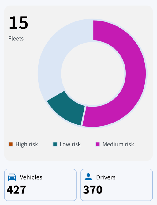
The Milliman scoring system is used to categorize fleet vehicles based on risk. Milliman scores are generated using various driving behaviors, such as braking, speeding, and mileage. These scores are then aggregated to provide a fleet-wide risk profile, which is visually represented in the pie chart below:
Grey
Green
Pink
Orange
Not Scored: Fleets with insufficient data (e.g., fewer than 20 days of driving data) are flagged as "unknown".
Low Risk: Indicates vehicles with higher Milliman scores, representing safer driving behavior and lower risk.
Medium Risk: Vehicles that fall into the moderate risk category based on their driving behaviour.
High Risk : Represents vehicles with lower Milliman scores, indicating higher risk levels. Fleets in this category may require policy adjustments.
This chart enables quick identification of the proportion of vehicles in each risk category, helping fleet managers and underwriters make informed decisions about safety improvements and insurance policies.
Additional Interactivity:
- Hover Functionality: Hovering over each section will provide detailed counts and percentages of fleets for each risk category.
- Total Fleet: Indicates that the system is monitoring 15 fleets, collectively managing 427 vehicles and 370 drivers, with the risk distribution clearly represented in the donut chart.
Trip Count by Region:
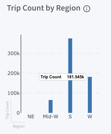
A bar chart displays the total number of trips across different regions (NE, Mid-W, S, W). Hovering over the bars reveals the trip count for each region, helping carriers analyse trip distribution.
- NE (Northeast), Mid-W (Midwest), S (South), and W (West) represent various regions.
- Each bar represents the number of trips completed in a specific region, with the exact trip count displayed when hovering over the bar.
Trip Classification:
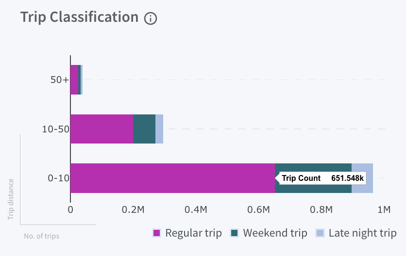
The horizontal bar chart categorizes trips into three types, showing the total number of trips alongside their corresponding trip distances.
Green
Grey
Pink
Late night Trips:
Taking place between 10 PM and 6 AM.
Weekend Trips:
Trips made on Saturdays and Sundays.
Regular Trips:
Occurring during regular hours (6 AM to 10 PM).
Hovering over the bar reveals the trip count for each category, providing a clear view of the distribution and helping to identify trends in trip activity.
Fleet Distribution:
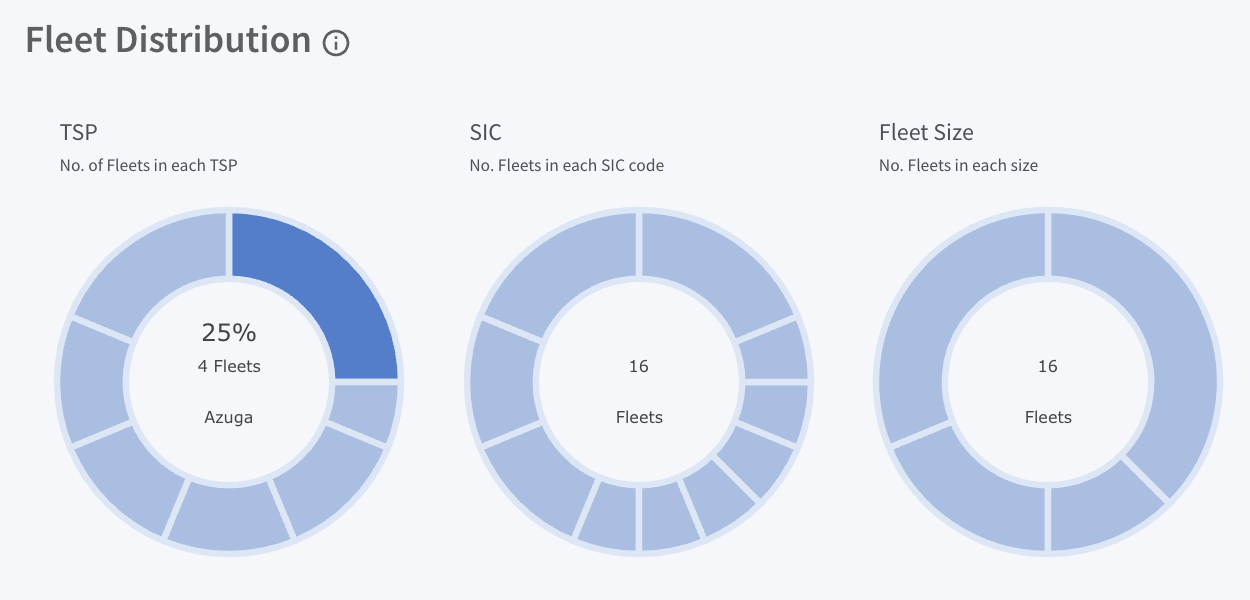
The Fleet Distribution section presents fleet cohorts based on three main criteria—TSP (Telematics Service Provider), SIC (Standard Industrial Classification), and Fleet Size—using dedicated donut charts for each. These charts provide a clear breakdown of fleet distribution across:
- TSP (Telematics Service Provider): Displays the number of fleets associated with each TSP. Hovering over donut sections reveals the telematics provider’s name with the count and percentage of fleets using that provider.
- SIC (Standard Industrial Classification): Displays the distribution of fleets across various industry types (e.g., transportation, construction). Moving the cursor over sections reveals the industry category along with the count and percentage of fleets within that industry, providing a quick overview of fleet composition by industry.
- Fleet Size: Breaks down fleets by size based on the number of vehicles. Hovering over each section reveals the fleet size along with the count and percentage distribution.
Events/100 Miles Heat Map:
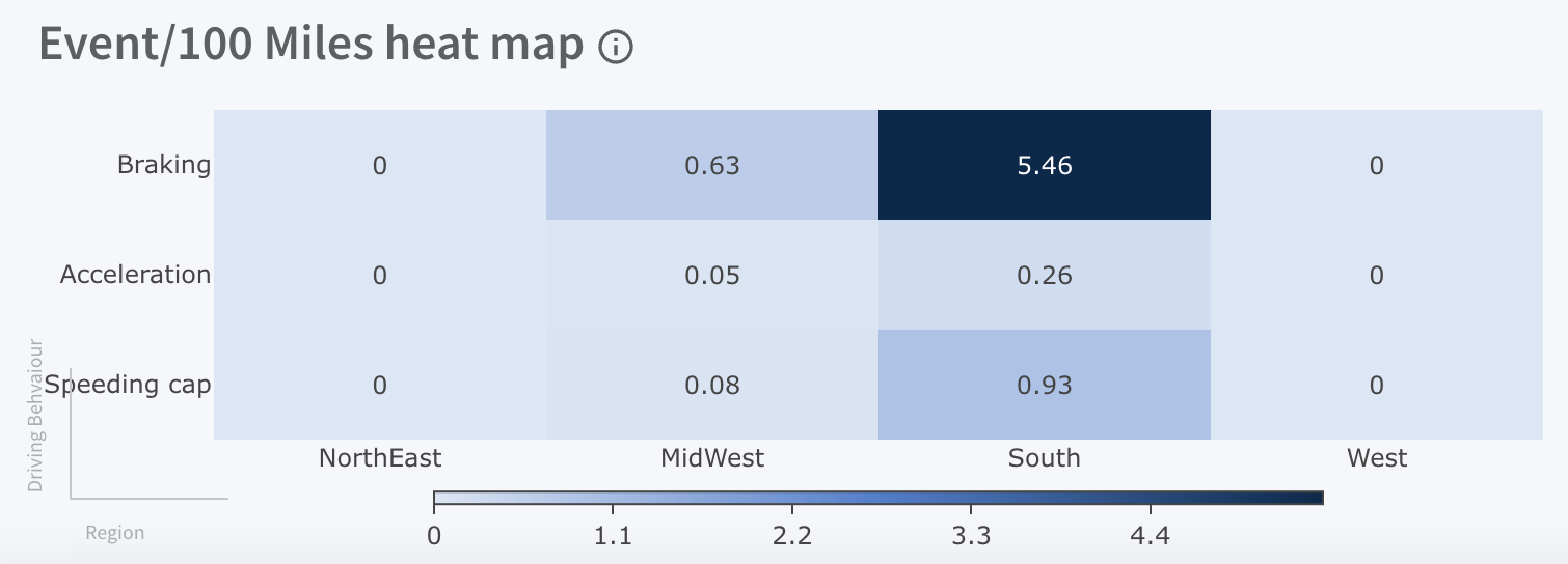
This heat map displays the distribution of events per 100 miles across various regions and event types. Darker colors indicate higher event frequencies, providing a clear visual representation of activity levels. The following event categories are tracked:
- Braking: Instances of hard braking.
- Acceleration: Instances of rapid acceleration.
- Speeding cap: Instances of speeding.
Regions (Northeast, Midwest, South, West) are listed along the bottom, with varying levels of event frequency displayed.
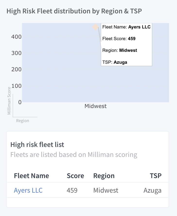
High-Risk Fleet Distribution by Region & TSP:
This graph displays the distribution of high-risk fleets by region and telematics service provider (TSP). The Milliman Score is used on the Y-axis to quantify fleet risk levels, while the X-axis represents regions, providing insight into where high-risk fleets are concentrated.
Key details include:
Represents the Milliman score, which is used to measure the fleet risk level. Higher scores indicate higher risk.
Y – Axis (Milliman Score):
Displays the geographical regions where fleets operate. In this example, the Midwest region is shown
X-Axis (Region):
Plot Points: Each point on the graph corresponds to a high-risk fleet. Hovering over a point reveals:
- Fleet Name: The name of the fleet (e.g., Ayers LLC).
- Fleet Score: The Milliman risk score assigned to the fleet (e.g., 459).
- Region: The geographical region where the fleet operates (e.g., Midwest).
- TSP (Telematics Service Provider): The telematics provider associated with the fleet (e.g., Azuga).
This visualization helps pinpoint high-risk fleets across different regions and TSPs, making risk management efforts more effective. A detailed table listing high-risk fleets by Milliman score is also available.
Additional Interactivity:
Interactive Fleet Access: Clicking on a fleet name opens the "Fleet Dashboard," offering comprehensive insights into the fleet’s performance.
Fleet Dashboard
The Fleet Dashboard provides a detailed view of a specific fleet within the entire portfolio. Carriers can select any fleet to analyze its performance in more depth, with an overview of key metrics, risk data, and performance graphs, all designed to help them monitor and optimize fleet operations.
Below is a detailed explanation of each section, highlighting valuable risk insights that can enhance decision-making.
AI-Powered Executive Summary:
Capabilities:
The Fleet Dashboard now includes an AI-generated Executive Summary at the top of the page, similar to the Program Dashboard. The summary analyzes fleet-level data and highlights key observations to help users quickly understand safety performance and trends.
- Provides a high-level overview of fleet performance
- Highlights key insights and behavioral trends
- Identifies potential risk indicators
Users Can:
- Click “Read More” to expand the insights panel
- View detailed analysis and recommendations
- Export insights for reporting and sharing
Notes:
- The executive summary is visible by default.
- Additional insights appear in an expandable panel.

Dashboard Structure and Navigation:
To improve usability and consistency, the Fleet Dashboard follows a structured layout similar to the Program Dashboard. The dashboard organizes insights into multiple sections such as:
- Overview
- Performance
- Compliance
- Risk Distribution
This structure enables quick navigation to relevant insights. Clicking any section instantly jumps to the corresponding content, reducing scrolling and improving discoverability of key analytics.
Dashboard Interactivity:
- Charts, tables, and visual components are interactive and clickable
- Users can explore detailed data by interacting with dashboard elements
This enables deeper analysis of fleet performance without leaving the dashboard.
Section Details:
1. Overview Section:
The Overview section provides a high-level summary of fleet activity and safety performance. It includes the following three key components:

1.A. Account Focus:
Highlights the most critical metrics of the telematics program. It provides a snapshot of key fleet-level metrics, including:
Clicking on the Accident tiles will take you to the Accident dashboard for detailed analysis of accident events and related insights.
1.B. Policy Focus:
Displays the count of Azuga fleet policies scheduled for renewal within the next 3–6 months, helping insurers monitor policy timelines and compliance status. It includes the following metrics:
- Program Start Date
- Program End Date
- Days Remaining
- Policy Violations
Milliman Scores | Total Events |
Vehicles | Avg. Events/100 Miles |
Drivers | Accidents |
Total Mileage |
|


1.C. Vehicle Distribution:
Shows how vehicles within the fleet are distributed across safety/risk score buckets, providing a granular view of fleet risk.
Vehicles are categorized into specific score ranges rather than broad classifications, enabling clearer visibility into risk distribution across the fleet. Each bucket is further represented by risk categories with color coding:
- Low Risk
- Medium Risk
- High Risk
- Unknown
This visualization helps users quickly identify how vehicles are distributed across different risk levels and understand the overall concentration of risk within the fleet.
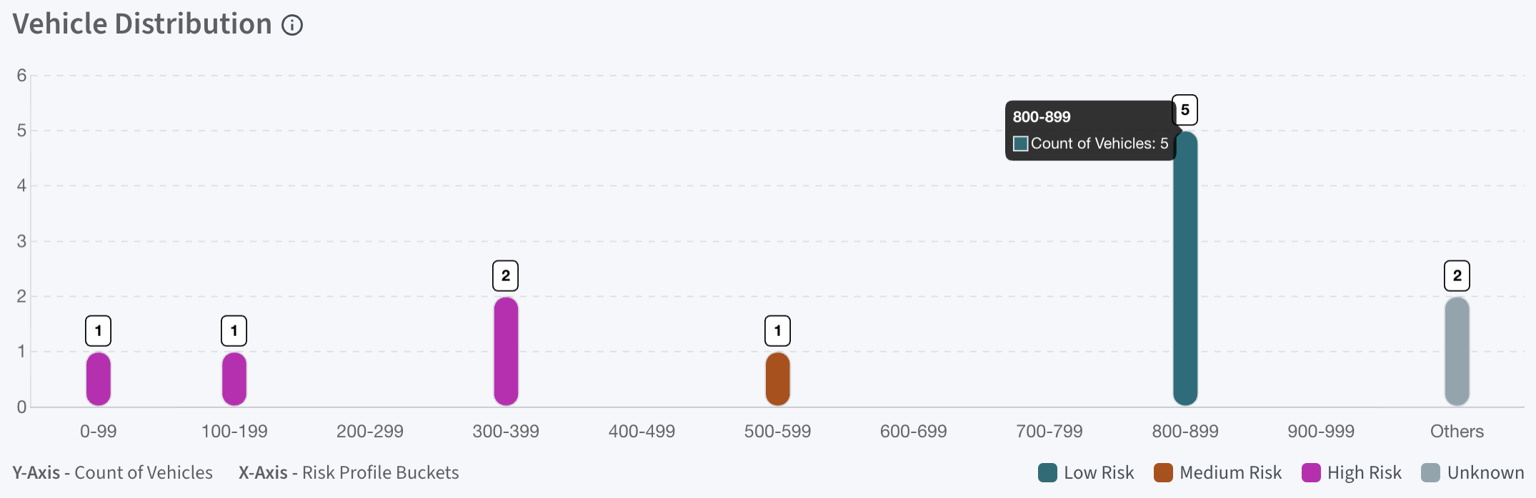
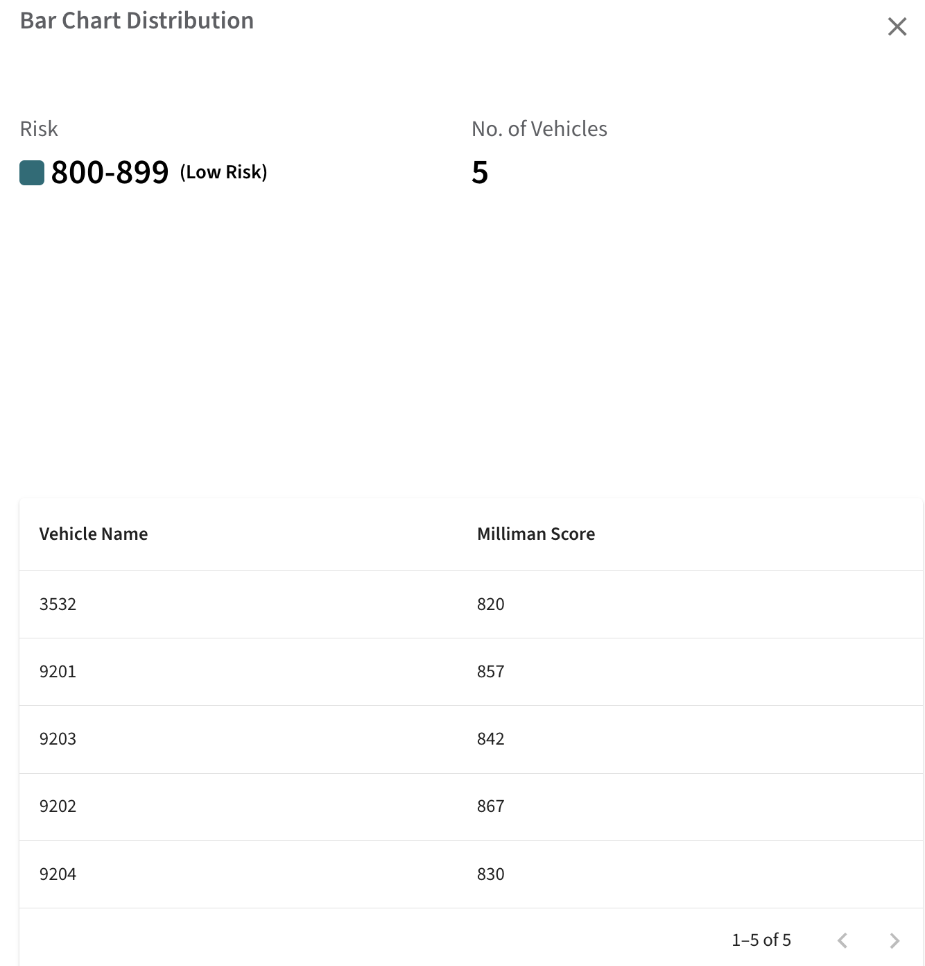
Clicking a bar in the chart opens a detailed view showing the vehicles within that score range, along with their Milliman scores for reference.
2. Performance Section:
The Performance section provides detailed insights into vehicle-level safety performance and operational trends.
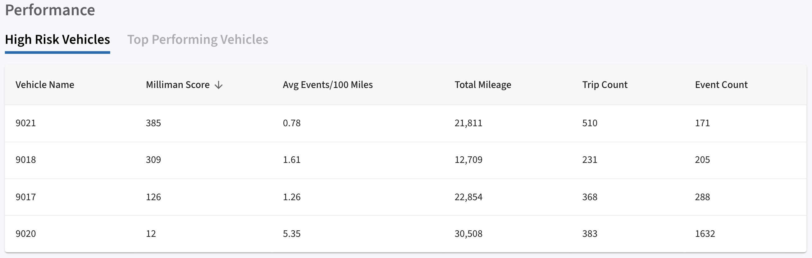
2.A. High Risk Vehicles:
Displays vehicles identified as high risk based on safety performance. It includes the following:
This helps insurers quickly identify vehicles requiring attention.
Vehicle Name | Total Mileage |
Milliman Score | Trip Count |
Avg Events/100 Miles | Event Count |
2.B. Top Performing Vehicles:
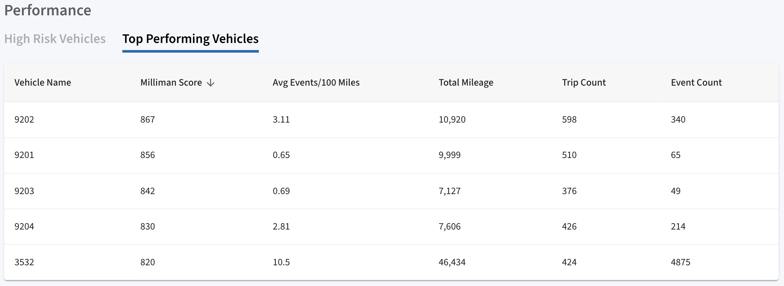
Highlights vehicles that demonstrate strong safety performance. It includes the following:
This enables benchmarking of best-performing vehicles within the fleet.
Vehicle Name | Total Mileage |
Milliman Score | Trip Count |
Avg Events/100 Miles | Event Count |
2.C. Miles by State:
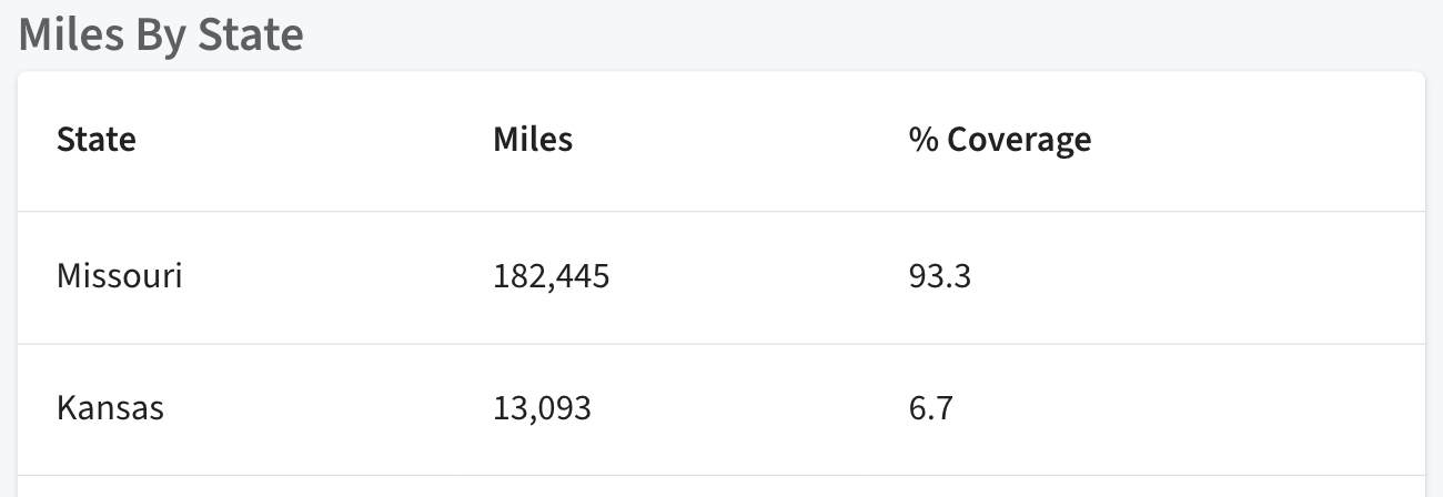
Displays geographic distribution of fleet activity, including:
- States where vehicles operated
- Total miles covered per state
- Percentage contribution
This provides visibility to where fleet activity is concentrated geographically.
2.D. Top Zip codes by Activity:
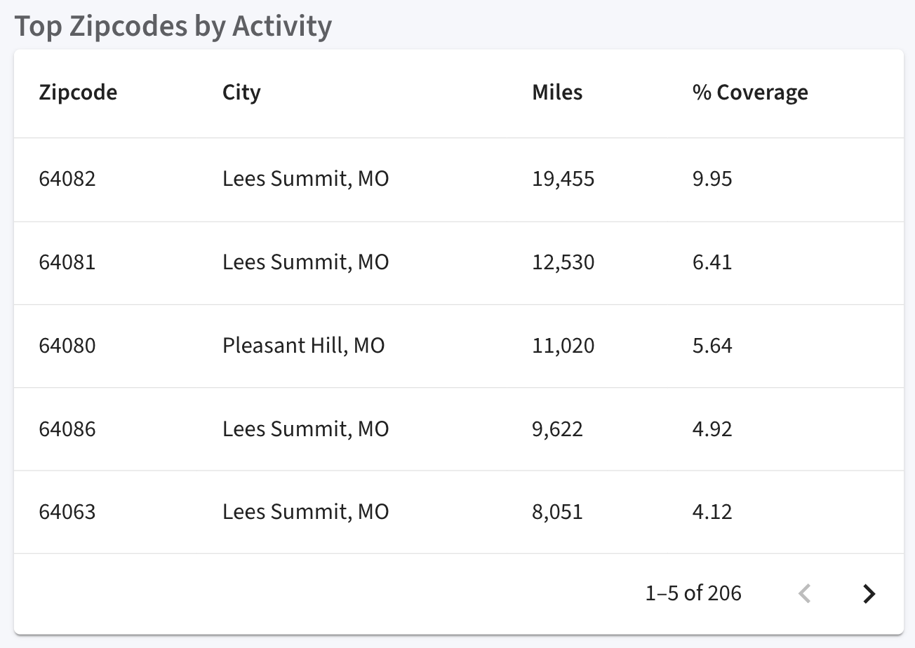
Provides a more granular view of activity distribution at the ZIP code level. It includes the following:
This helps identify high-activity operational areas.
Zip code | City | Miles | % Coverage |
2.E. Active Vehicles:
Displays all vehicles that were active during the selected time range. Includes key metrics such as:
This section provides operational visibility into fleet activity.
3. Compliance Section:
The Compliance section provides visibility into device deployment and connectivity status at the fleet level, helping users monitor device health and identify potential gaps.
3.A. Device Focus Section:
Highlights overall device counts for Azuga fleets within your telematics program. This section provides a fleet-level view of device deployment.
It displays counts for:
VIN | Avg Events/100 Miles |
Make | % Speeding |
Model | % Braking |
Year | % Acceleration |
Total Safety Events | % Idling |
Milliman Score | % PSL |
Total Azuga Devices | Total SafetyCam |
Total OBD Devices | Total OEM Devices |
Total Asset Trackers |
|
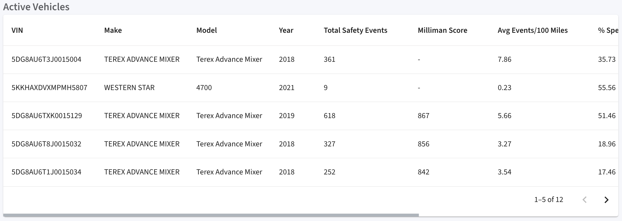
This provides a quick overview of device distribution and coverage across the fleet.
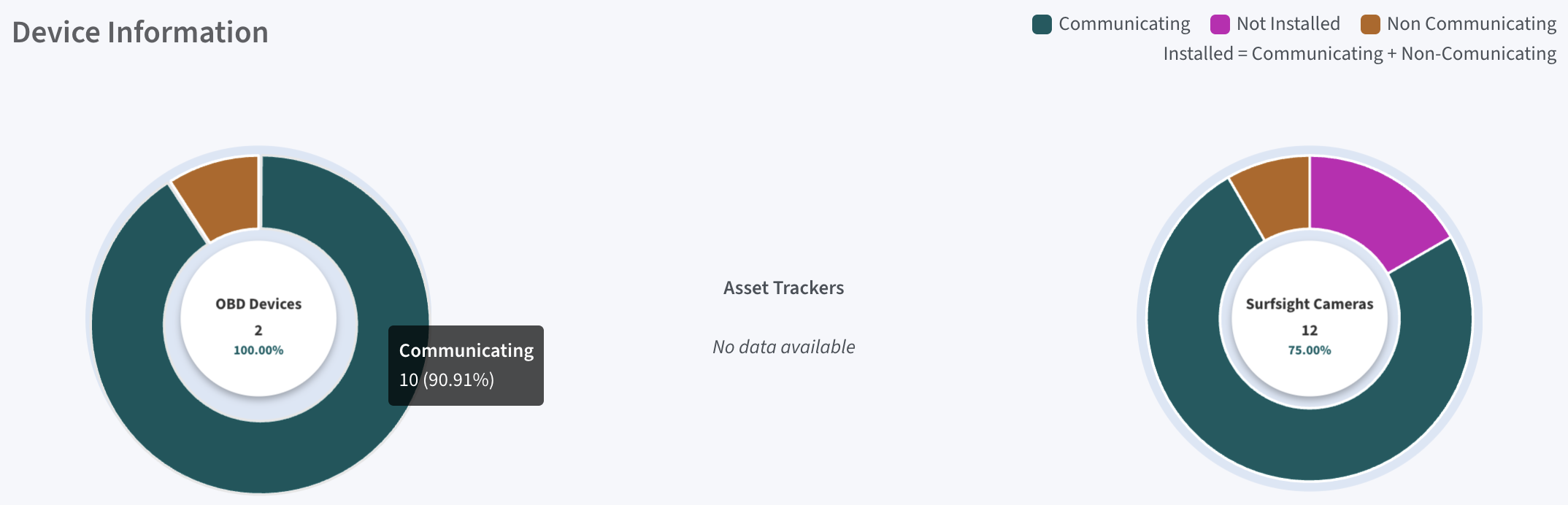
3.B. Device Information:
Visual donut charts represent device status across different device types. Each state is represented using distinct color coding for quick visual identification. Device states include:
- Communicating
- Non-communicating
- Not-Installed
Clicking on a segment of the chart takes the user to the corresponding Device Dashboard for that device type. These insights help identify:
- Devices that are not reporting data (non-communicating)
- Installation gaps
- Connectivity issues impacting fleet visibility

4. Risk Distribution Section:
The Risk Distribution section provides a consolidated view of fleet risk exposure and driving behavior patterns, helping users understand where, when, and how risk is occurring within the fleet.
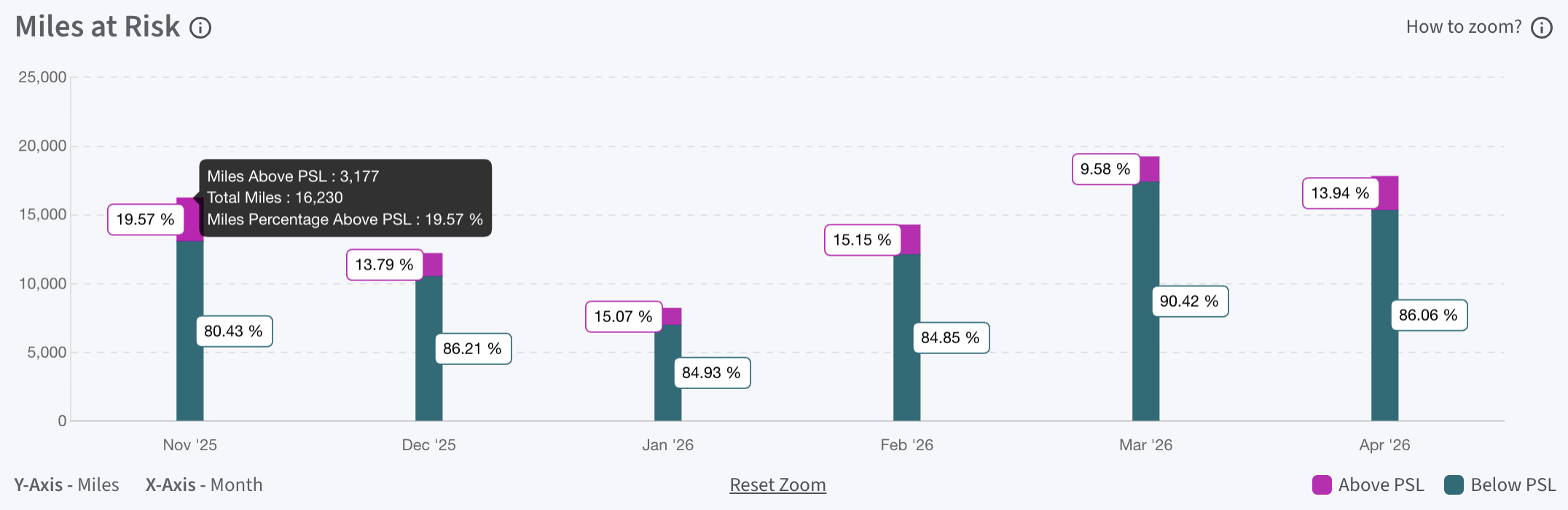
4.A. Miles at Risk:
Displays the total miles driven above and below posted speed limits (PSL) on a month-on-month basis. This metric standardizes speeding analysis by comparing actual vehicle speed from GPS data against road speed limits, rather than relying on configurable device thresholds. By eliminating dependency on manually set limits, it provides a consistent and unbiased measure of driving risk across fleets.
The visualization presents a stacked bar chart for each month:
- Hovering over the bars displays the total miles driven for the month, along with the miles above and below PSL, while percentage labels indicate the proportion of miles in each category.
- The bar is divided into two color-coded segments:
- Pink (Above PSL): Miles driven above posted speed limits (risky driving)
- Teal (Below PSL): Miles driven within posted speed limits (safer driving)
This view helps users quickly understand trends in risky vs. safe driving behavior over time.
4.B. Event Activity:
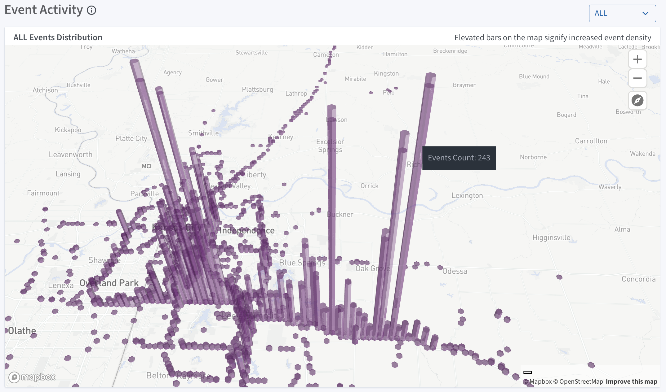
Displays safety event data across geographic locations, enabling users to visualize where events are occurring within the fleet. Users can view and filter events by type, including:
- All
- Braking
- Speeding
- Acceleration
- PSL
The map is interactive and supports zooming and panning, allowing users to explore events at different geographic levels. Hovering over the bars displays the event count for that location.
- Elevated bars represent event density, with taller bars indicating a higher concentration of events
- Hotspots highlight areas with frequent safety events; zooming in provides a clearer view of their intensity
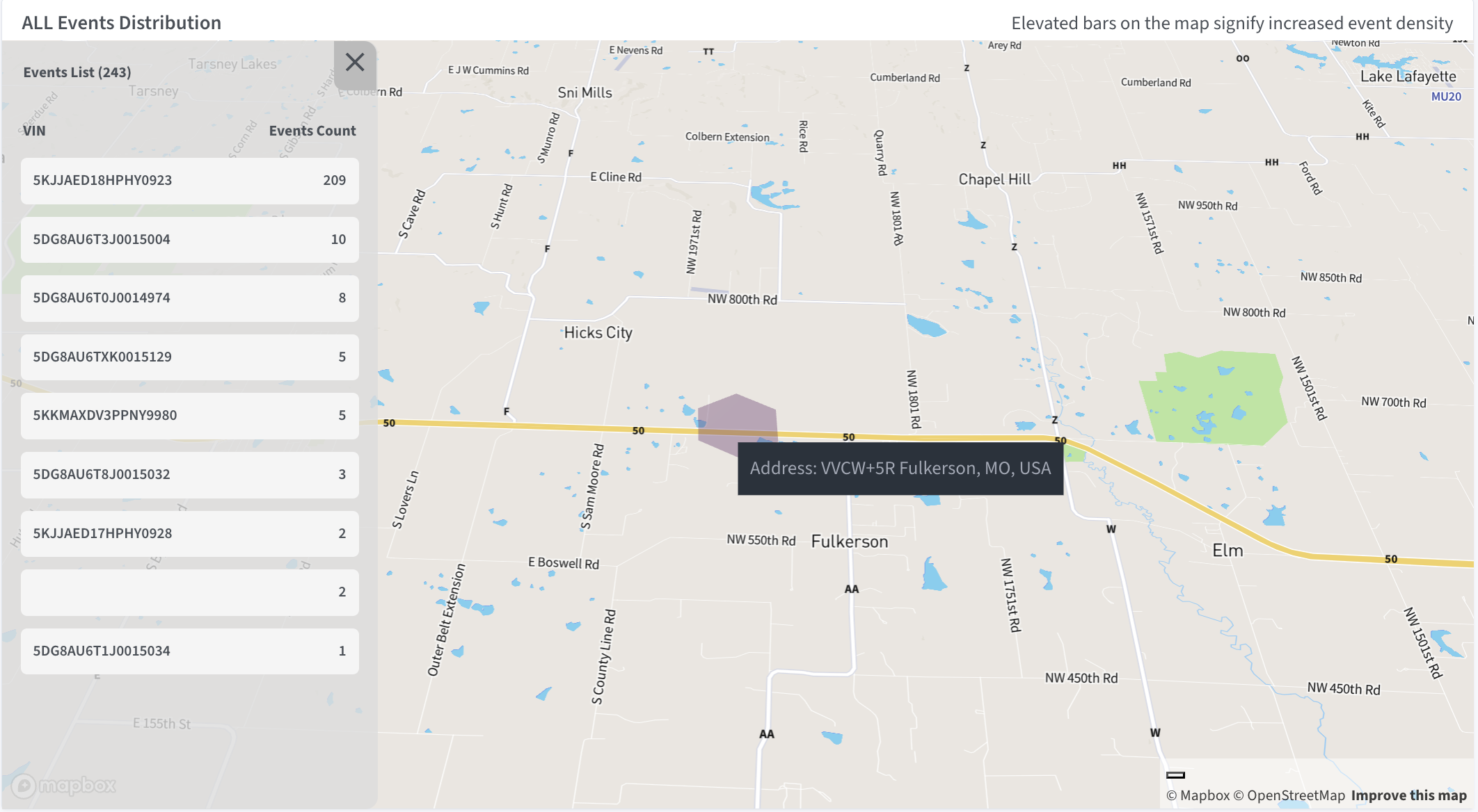
Clicking on a bar opens a detailed view showing the list of vehicles and corresponding event counts, along with the exact event location. This visualization helps insurers quickly identify high-risk areas and patterns in driving behavior.
4.C. Fleet Benchmarking:
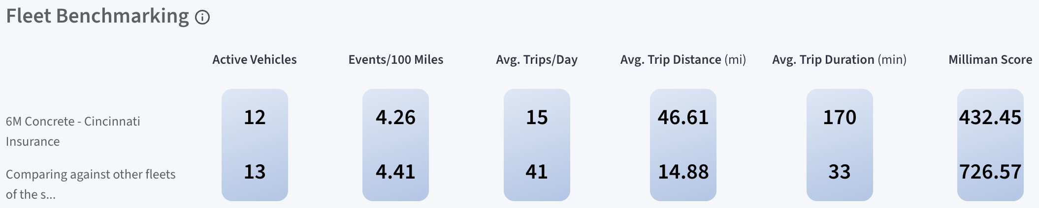
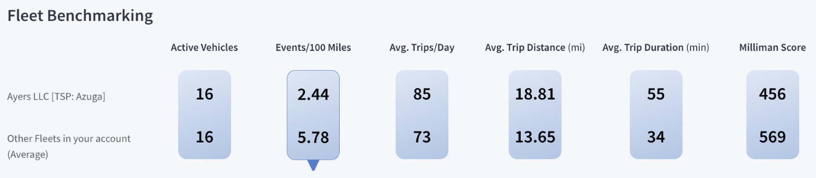
Compares the selected fleet against other fleet cohorts of similar size to help insurers understand relative performance.
The comparison is based on key performance metrics, including:
The dashboard presents side-by-side values for:
- The selected fleet
- The peer cohort (similar fleet size)
This enables users to quickly assess whether a fleet is performing better or worse than comparable fleets. A key indicator is Events per 100 Miles, which helps evaluate safety performance and risk exposure. For example, a higher value compared to the cohort indicates relatively poorer performance. This view helps insurers:
- Benchmark fleet performance against peers
- Identify underperforming fleets
- Understand operational differences across similar fleet sizes
Active Vehicles | Average Trip Distance (mi) |
Events per 100 Miles | Average Trip Duration (min) |
Average Trips per Day | Milliman Score |
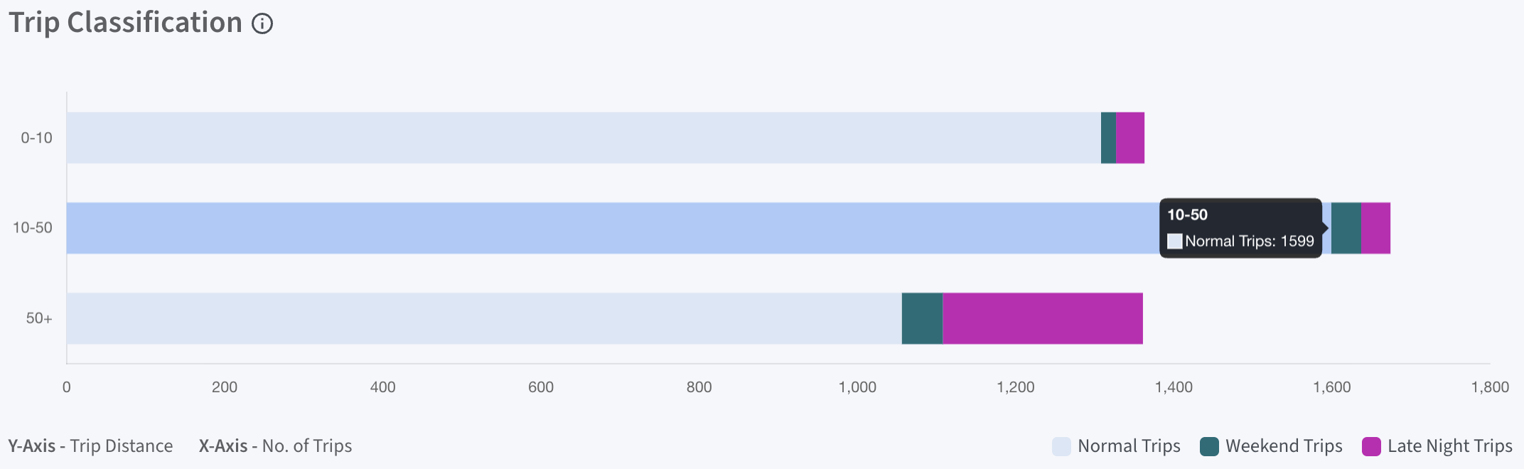
4.D. Trip Classification:
Provides insights into when trips occur and how they are distributed across distance ranges.
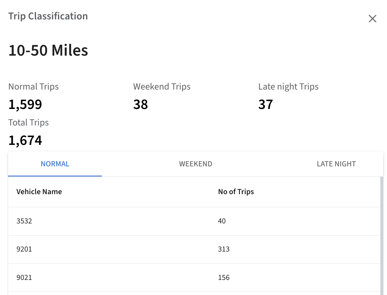
- Trips are categorized by time as Regular (6 AM – 10 PM), Late Night (10 PM – 6 AM), and Weekend (Saturday & Sunday) and displayed across distance ranges (0–10, 10–50, 50+ miles) using color-coded segments with Light Blue for Regular trips, Teal for Weekend trips, and Purple for Late Night trips, providing a clear view of trip distribution.
- Hovering over the bars displays the trip countfor each category within the selected distancerange.
Clicking on a bar opens a detailed Trip Classification view, showing total trips by category along with a vehicle-level breakdown of trip counts. This helps insurers understand driving patterns and identify time-based risk exposure.
4.E. Activity:
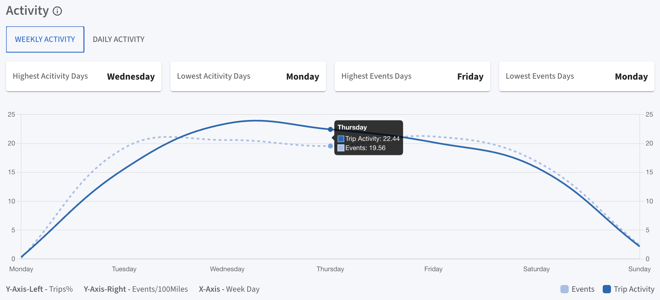
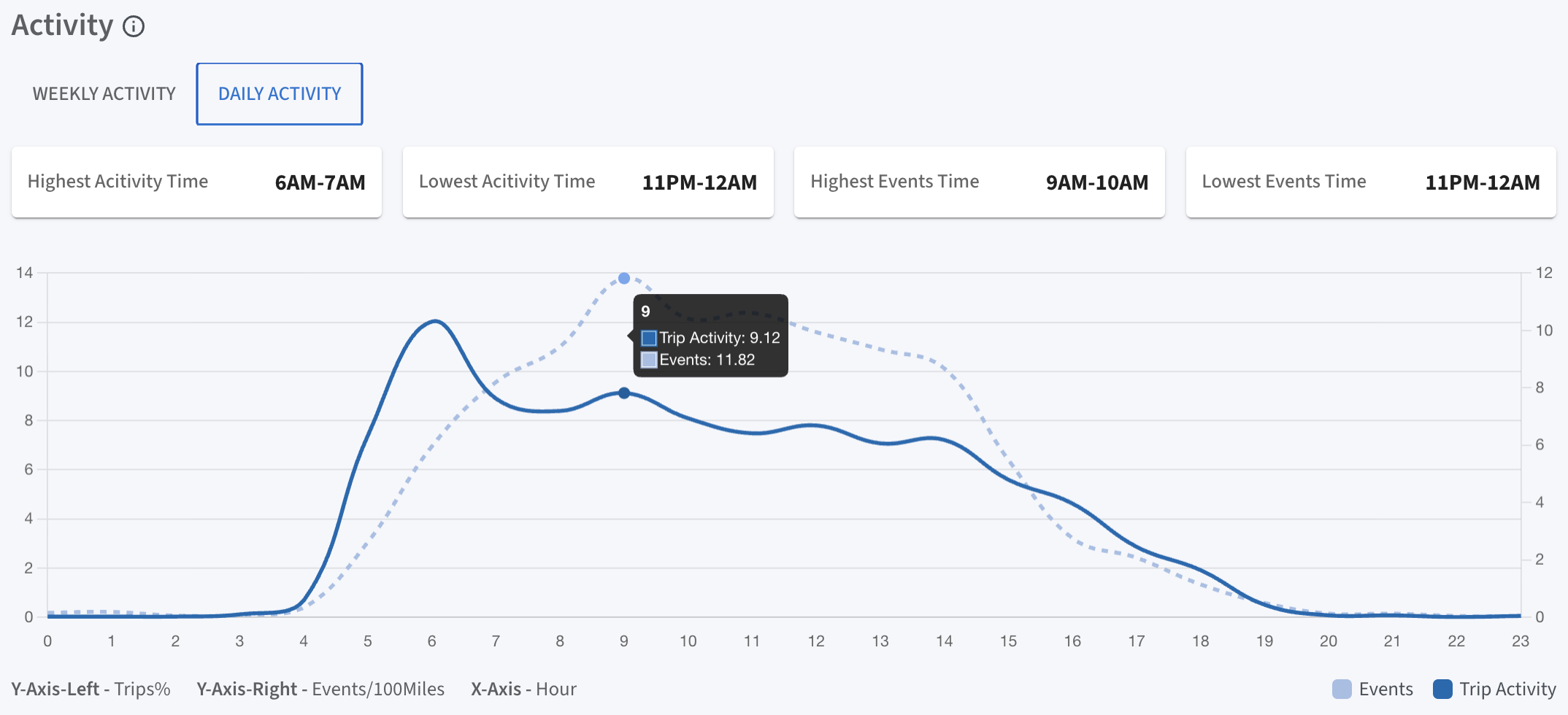
Provides insights into when the fleet is most active by analyzing trends across days of the week and hours of the day.
Users can switch between:
- Weekly Activity to view trends by day
- Daily Activity to view trends by hour
The charts display two metrics:
- Trip Activity (Solid Blue Line): Represents the percentage of trips
- Events (Dotted Light Blue Line): Represents events per 100 miles
Key highlights include:
- Most active days and times
- Lowest activity periods
- Highest and lowest event periods
Hovering over the chart displays detailed values for both trip activity and events at a specific day or hour. This visualization helps identify time-based patterns in fleet behavior and risk exposure.
Insights
Insights
SafetyIQ's Insights section empowers insurers to evaluate fleet safety and risk through trip histories, event analyses, common trips, benchmarking, mileage tracking, garaging insights, and predictive risk assessments powered by AccuRate by Milliman.
The Insights page simplifies fleet analysis with intuitive tools and visualizations that support informed decision-making. It is structured into the following components:
Input Selection:
Users can customize data views by applying filters and selecting specific criteria. This ensures the analysis is focused on the most relevant information, helping to address operational priorities effectively.
Map View:
An interactive map enables users to visualize operational activity geographically, providing insights that support better planning and resource allocation.
Data Table:
A detailed table presents organized information to facilitate deeper analysis. This helps uncover patterns, identify key focus areas, and prioritize actionable insights.
Summary Cards:
These provide a concise overview of essential metrics, offering a quick snapshot of overall performance. This helps users monitor trends and identify areas requiring further exploration.
Together, these components create a comprehensive platform for monitoring and improving operational efficiency, safety, and overall performance.
Data Filtering & Reporting:
TSP (Telematics Service Provider) Filter:
Allows users to select all fleets or a specific TSP, providing tailored data views based on the different systems in use.
Date Selection:
By default, the UI displays data for the last 12 months, with options to view the last month, last three months, last quarter, or year to date—making it easier to track patterns, review incidents, and assess performance over specific periods.
Driver, Vehicle, VIN, Vin Count, Event Types Filter:
Offers filtering by specific drivers, vehicles, VINs, Vin count, event types supporting detailed analysis on targeted performance and activities.
Schedule Report:
Set up a recurring schedule to automatically generate and send Trip History reports at your preferred intervals. Reports are sent to recipients on the 5th of every month.
Export Page:
Export the current Trip History view to save or share the data for external analysis.
Insights – Trip History
Trip History
Trip History:
This page displays detailed trip records, including routes, duration, mileage, and other trip-specific data.
Key safety metrics are displayed for the selected period, giving a quick summary:
- Total Trips: Displays the total number of trips completed within the selected period (30.46K in this example), indicating fleet’s activity volume.
- Total Distance (mi): Represents the fleet’s total miles driven (573K miles), helping insurers assess mileage patterns.
- Total Events: Counts all events (10.16K), including potential risks, and provides insights into fleet driving behavior.
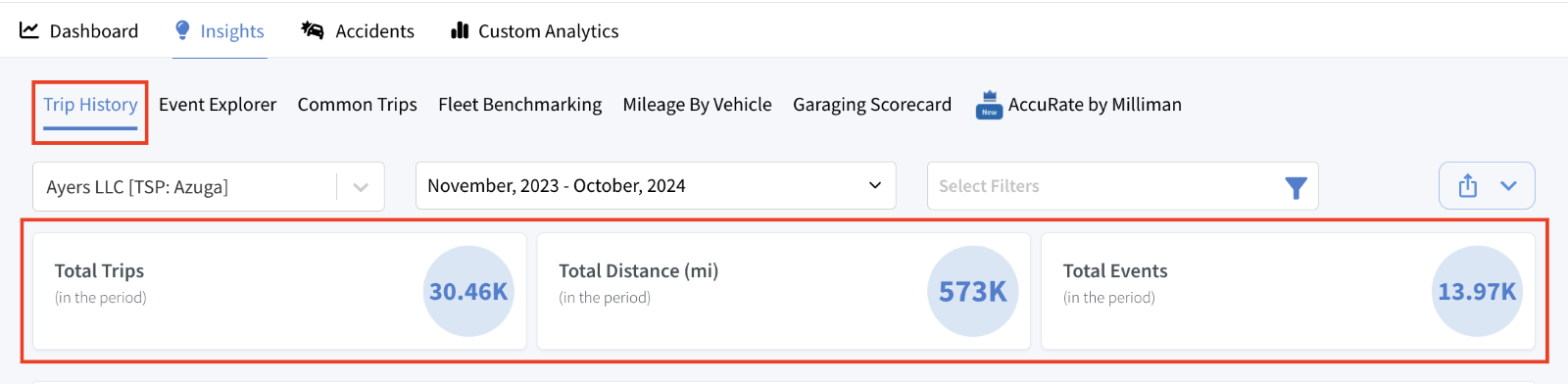
Trip History
Trips Activity:
This section provides a geographic map with a visual representation of trip density. Elevated bars on the map indicate areas with high trip activity, helping insurers understand where fleet activity is concentrated, pinpoint high-risk areas, and track regional travel patterns.
Hovering over the bars reveals the exact number of trips to that location. Clicking on a bar opens a new screen displaying:
- Trip List: Shows the total number of trips recorded for the selected location (e.g., 1239 trips).
- VIN & Trip Count: Lists unique VINs with respective trip counts for vehicles visiting that area.
- Highlighted Zone: Highlights the selected location on the map; hovering over it shows the address for easy identification.
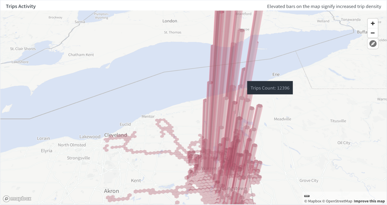
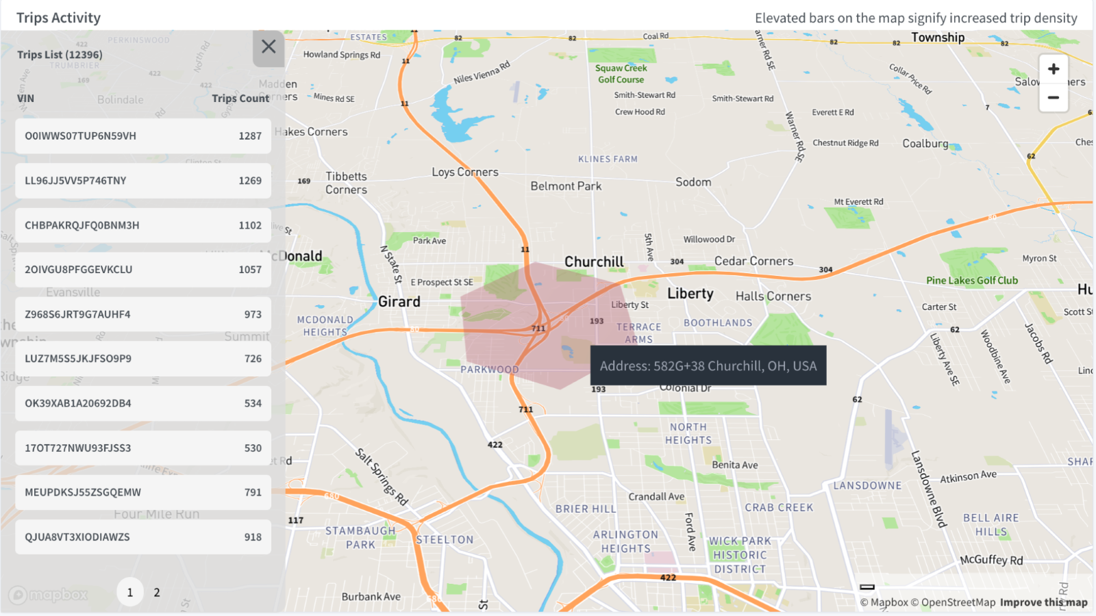
Trip History
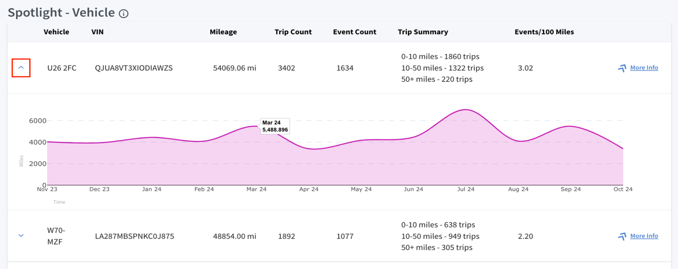
Spotlight-Vehicle:
It displays the top 10 vehicles in the fleet with the highest Mileage and Events/100 miles.
The data points for each vehicle, as shown in the table, include:
- Vehicle ID and VIN: Displays the vehicle IDs and VINs, crucial for tracking individual vehicles within the fleet.
- Mileage: Total miles driven by the vehicle.
- Trip Count: Total number of trips completed by vehicle.
- Event Count: Number of recorded events, including risky driving behaviors like harsh braking, speeding, or rapid acceleration.
- Trip Summary: Categorizes trips by distance brackets:
- 0-10 miles: Short trip
- 10-50 miles: Medium-distance trips
- 50+ miles: Long-distance trips, often for intercity routes, useful for identifying high-mileage vehicles.
- Events/100 Miles: This metric indicates the number of events that occurred per 100 miles. A higher value signifies a higher rate of incidents relative to distance traveled, aiding in the identification of high-risk vehicles.
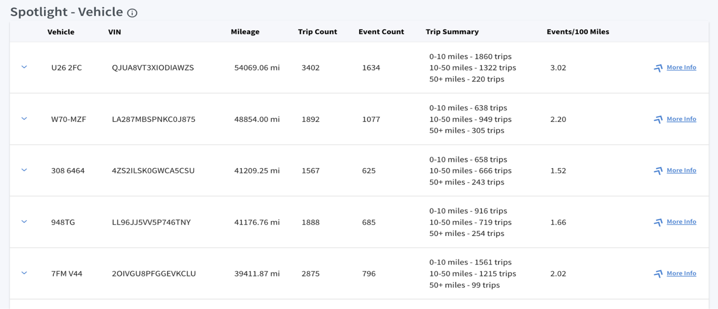
Trip History
Mileage Trends Analysis:
In the Spotlight - Vehicle section, a drop-down arrow on the left expands to display a detailed trend graph. This interactive graph visualizes each vehicle’s total miles driven per month.
Hovering over data points reveals exact mileage and time details for that given period, allowing insurers to identify periods of high or low activity.
More Info:
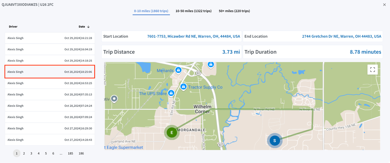
It provides the ability to drill down into specifics for selected vehicles, offering insights into mileage ranges, trip patterns by distance, and assessment of overall trip performance for a deeper analysis.

Trip History
Key details include:
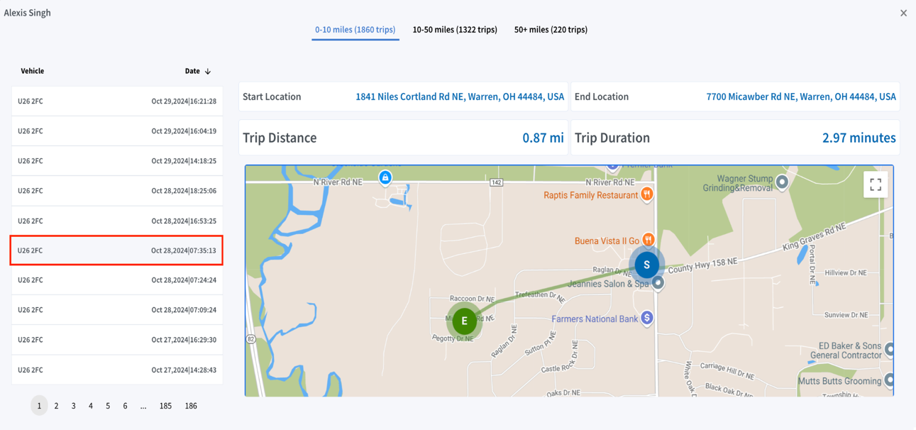
- Trip Categories by Distance: Trips are grouped into three categories—0-10 miles, 10-50 miles, and 50+ miles—showing the total number of trips in each range.
- Trip List Panel: Located on the left, this panel shows a chronological list of individual trips, including driver details, date, and time for each trip. The list can be reordered as needed.
- Detailed Trip View: Selecting any trip from the list reveals detailed trip information on the right, including:
- Start and End Location: Exact addresses for both the start and end of the trip, providing precise journey tracking.
- Trip Distance: Total distance travelled in miles, for a quick assessment of trip length.
- Trip Duration: Total trip time in minutes.
- Trip Route Map: A map showing the route taken, with markers indicating the Start (S) and End (E) points, helping insurers better understand travel patterns.
Trip History
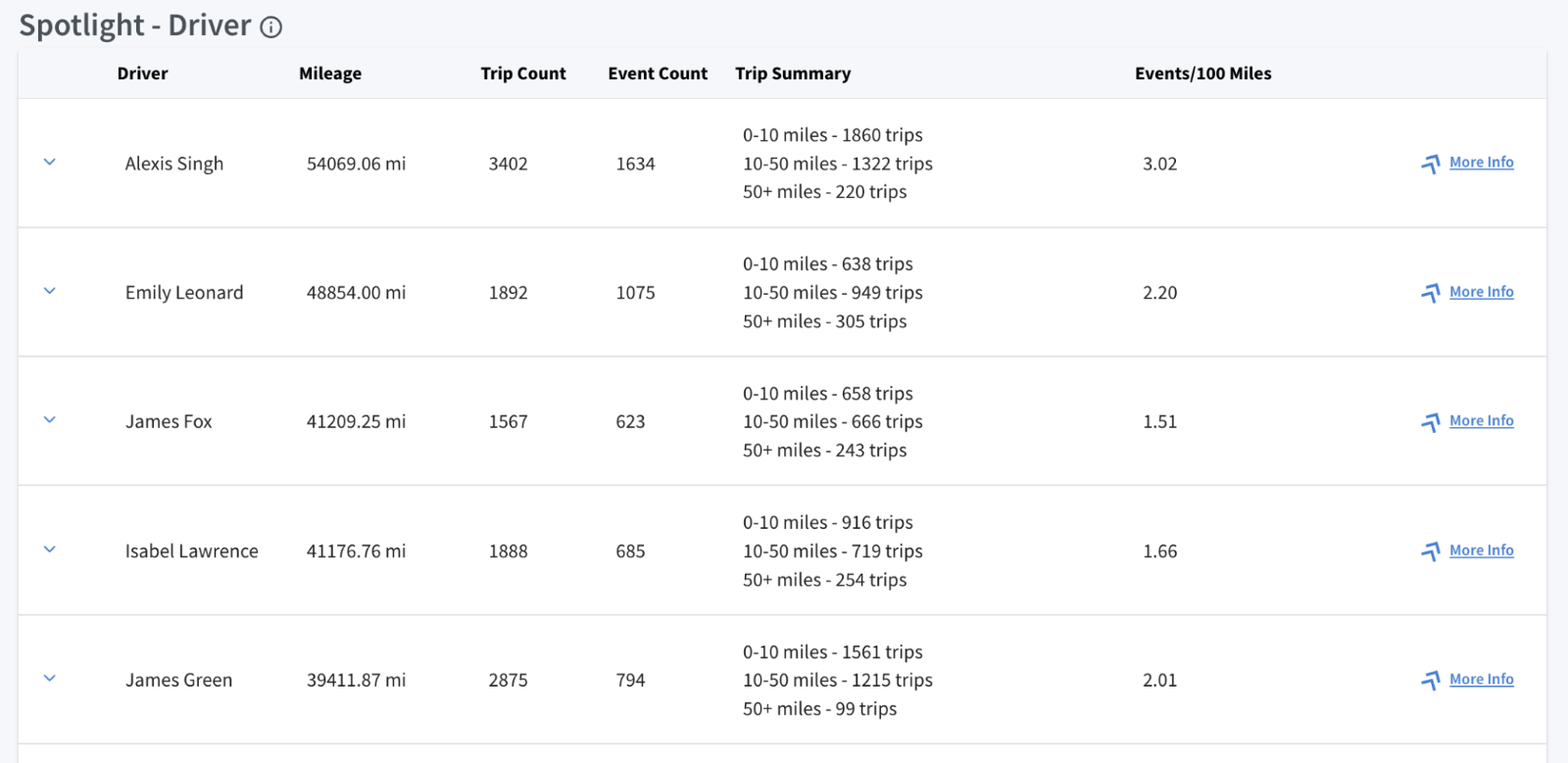
Spotlight-Driver:
It displays the top 10 risky drivers in the fleet with the highest Mileage and Events/100 miles.
The data points for each driver, as shown in the table, include:
- Driver: Displays the driver’s name, essential for tracking individual driving performance and behavior.
- Mileage: Total miles driven by the driver, useful for understanding exposure.
- Trip Count: Number of trips completed by the driver, indicating driving activity.
- Event Count: The total count of risky driving events associated with the driver.
- Trip Summary: Categorizes trips based on distance brackets (0-10, 10-50, and 50+ miles), providing insights into driving patterns and potential risk exposure related to trip length.
- Events/100 Miles: This metric indicates the number of events that occurred per 100 miles. Higher values indicate higher risk.
Trip History
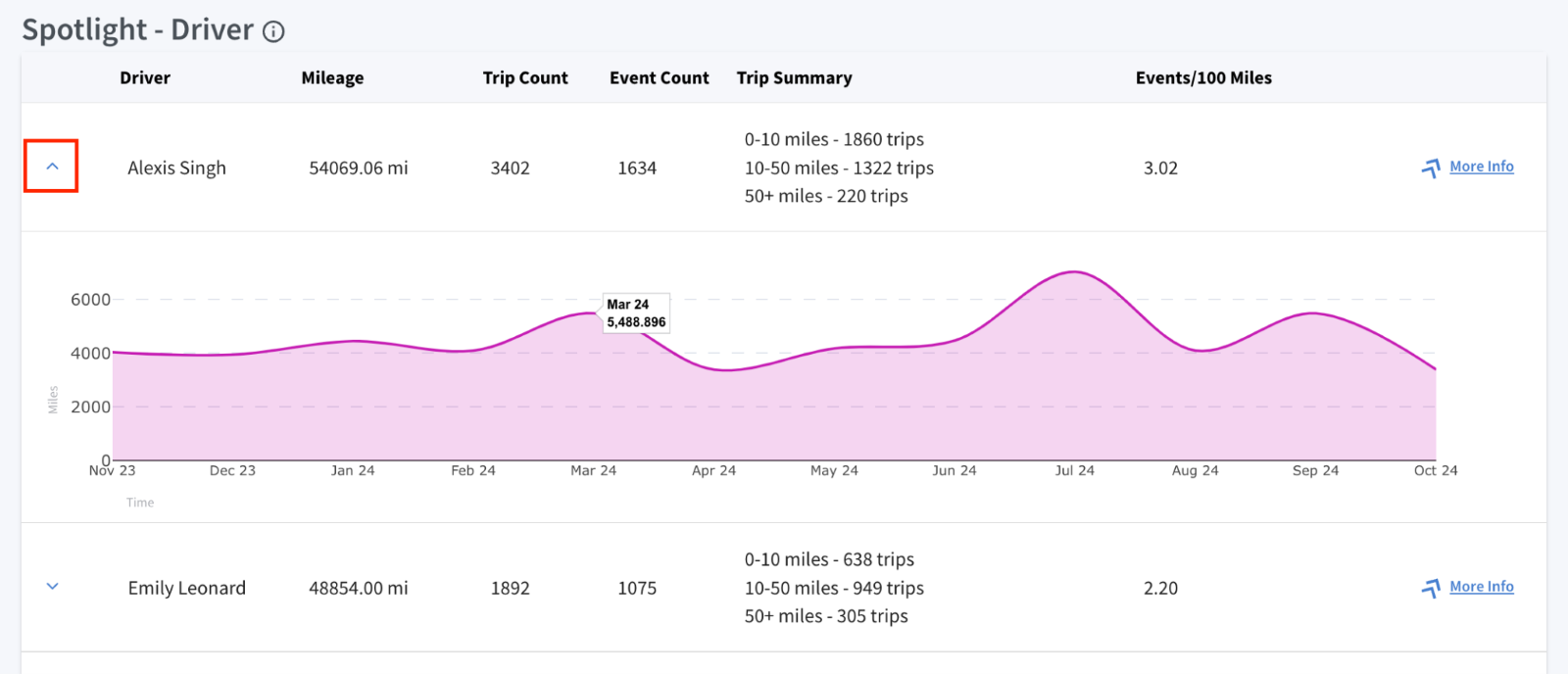
Mileage Trends Analysis:
In the Spotlight - Driver section, the drop-down arrow on the left expands to display a detailed trend graph. This interactive graph visualizes each driver’s total miles driven per month.
Hovering over the data points reveals the exact mileage and time details for that given period, allowing insurers to track driving patterns and monitor each driver's activity.
Trip History
More Info:
Provides the ability to drill down into specifics for selected drivers, offering insights into mileage ranges, trip patterns by distance, and assessment of overall trip performance for a deeper analysis.
Key details include:
- Trip Categories by Distance: Trips are grouped into three categories—0-10 miles, 10-50 miles, and 50+ miles—showing the total number of trips in each range.
- Trip List Panel: Located on the left, this panel shows a chronological list of individual trips, including vehicle details, date, and time for each trip. The list can be reordered as needed.
- Detailed Trip View: Selecting any trip from the list reveals detailed trip information on the right, including:
- Start and End Location: Exact addresses for both the start and end of the trip, providing precise journey tracking.
- Trip Distance: Total distance travelled in miles, for a quick assessment of trip length.
- Trip Duration: Total trip time in minutes.
- Trip Route Map: A map showing the route taken, with markers indicating the Start (S) and End (E) points, helping insurers better understand travel patterns.

Insights – Event Explorer
Event Explorer
Event Explorer:
The Event Explorer offers a detailed view of safety-related events for vehicles and drivers, including incidents like hard braking, speeding, and rapid acceleration. It allows for an in-depth analysis of these driving events to better understand individual driving behaviors and identify potential safety risks. By organizing safety data, it highlights trends and pinpoint areas with frequent high-risk incidents or concentrated event activity.
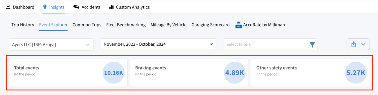
Key safety metrics are displayed for the selected period, giving a quick summary:
- Total events: Shows the total number of recorded events.
- Breaking events: Shows the count of braking incidents, helping identify occurrences of sudden or harsh braking.
- Other safety events: Counts other critical events, such as speeding and rapid acceleration, to further assess risky driving patterns.
Event Explorer
Safety Event Hotspots:
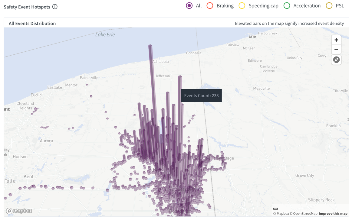
A map visualizes safety event hotspots across different locations, helping identify areas with high event densities. Elevated bars represent increased event frequency, and the zoom functionality allows for a more detailed assessment of intensity.
Filters enable selection of specific event types, with each type color-coded for easy identification:
- All: Displays all event types.
- Braking: Highlights only braking events
- Speeding: Highlights only speeding events
- Acceleration: Highlights only rapid acceleration events.
- PSL: Highlights only posted speed limit events.
Event Explorer
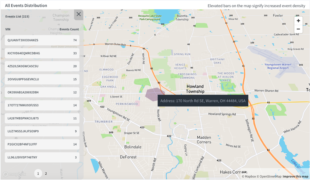
Hovering over the bars reveals the exact number of events count for that location. Clicking on a bar opens a new screen displaying:
- Event List: Shows the total number of events recorded for the selected location (e.g., 223 trips).
- VIN & Events Count: Lists unique VINs with respective event counts for vehicles visiting that area.
- Highlighted Zone: Highlights the selected location on the map; hovering over it shows the address for easy identification.
Event Explorer
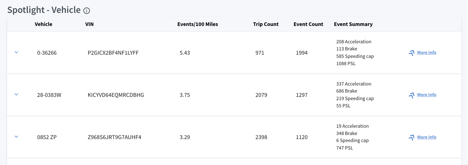
Spotlight – Vehicle:
It displays the top 10 vehicles in the fleet with the highest Trips and Events/100 Miles.
The data points for each vehicle, as shown in the table, include:
- Vehicle ID and VIN: Displays the vehicle IDs and VINs, crucial for tracking individual vehicles within the fleet.
- Events/100 Miles: This metric indicates the number of events that occurred per 100 miles. A higher value signifies a higher rate of incidents relative to distance traveled, aiding in the identification of high-risk vehicles.
- Trip Count: Total number of trips completed by vehicle.
- Event Count: Number of recorded events, including risky driving behaviours like harsh braking, speeding, rapid acceleration, and PSL associated with the vehicle.
- Event Summary: Provides a breakdown of recorded events by driving behaviors, including acceleration, braking, speeding, and exceeding the posted speed limit (PSL).
Event Explorer
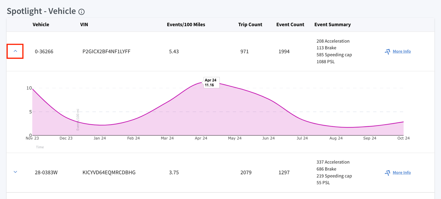
Mileage Trends Analysis:
In the Spotlight – Vehicle section, a drop-down arrow on the left expands to display a detailed trend graph. This interactive graph visualizes a vehicle’s monthly events/100 miles.
Hovering over data points reveals average value of events/100 miles for that given period, providing insurers with valuable insights into driving patterns and risk levels.
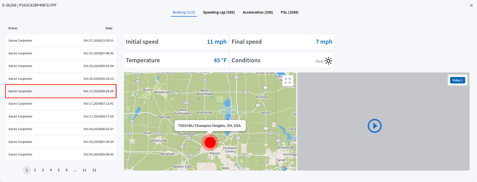
More Info:
Provides the ability to drill down into specifics for selected vehicles, offering insights into events, speed patterns, video footage availability, and overall safety assessments for deeper analysis

Event Explorer
Key details include:
- Event Categories: Events are classified into key types, including Braking, Speeding, Acceleration, and PSL, allowing for quick identification and detailed assessment of each event.
- Event List Panel: Located on the left, this panel displays a chronological list of individual events, including driver details, along with the date and time of the events (e.g., Braking in this case).
- Detailed Event View: Selecting an event from the list provides detailed information on the right, including:
- Speed Information: Displays the initial speed (e.g., 10 mph) and final speed (e.g., 3 mph) recorded during the event.
- Weather Conditions: Shows the temperature (e.g., 35°F) and indicates weather conditions, such as clear and sunny, to provide context for the driving environment.
- Map Location: Highlights the event location on a map with an exact address marker (e.g., for a Braking event), aiding in tracking where the event occurred.
- Video Footage: Includes "Video 1" and "Video 2" buttons to access road-facing and driver-facing footage of the selected event.
Event Explorer
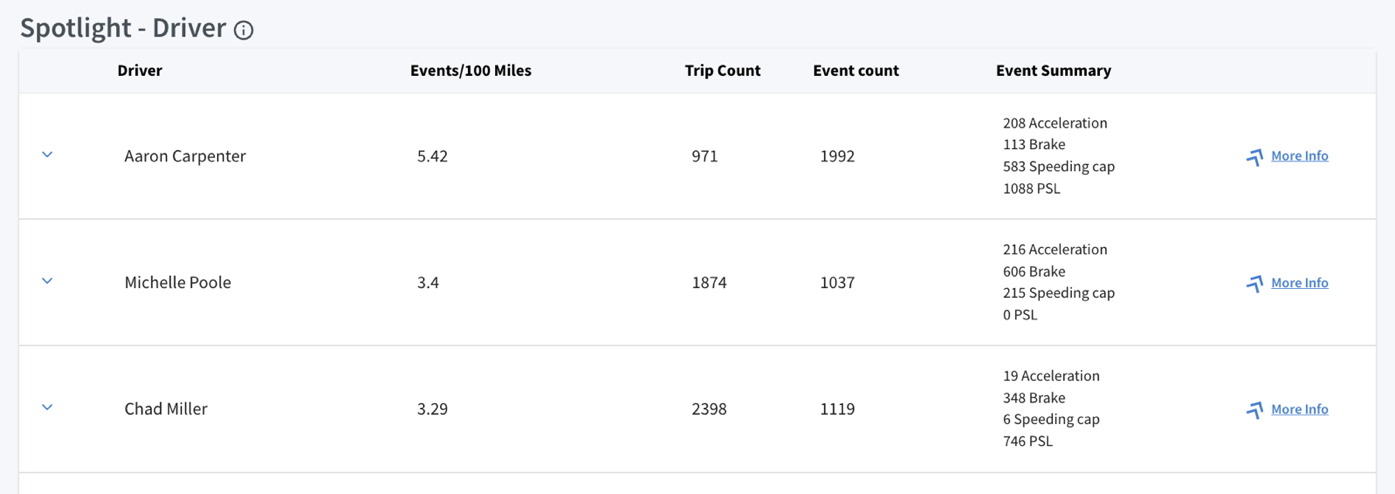
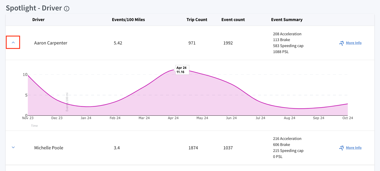
Spotlight – Driver:
It displays the top 10 risky drivers in the fleet with the highest Trips and Events/100 miles.
The data points for each driver, as shows in the table, include:
- Driver: Displays the driver’s name, essential for tracking individual driving performance and behavior.
- Events/100 Miles: This metric indicates the number of events occurred per 100 miles. Higher values indicate higher risk.
- Trip Count: Number of trips completed by the driver, indicating driving activity.
- Event Count: Number of recorded events, including events like harsh braking, speeding, rapid acceleration, and PSL associated with the driver.
- Event Summary: Provides a breakdown of recorded events by driving behaviors, including acceleration, braking, speeding, and exceeding the posted speed limit (PSL).
Event Explorer
Mileage Trends Analysis:
In the Spotlight - Driver section, the drop-down arrow on the left expands to display a detailed trend graph. This interactive graph visualizes a driver’s monthly events/100 miles.
Hovering over data points reveals average value of events/100 miles for that given period, providing insurers with valuable insights into driving patterns and driver activity.
More Info:
Provides the ability to drill down into specifics for selected drivers, offering insights into events, speed patterns, video footage availability, and overall safety assessments for deeper analysis.
Event Explorer
Key details include:
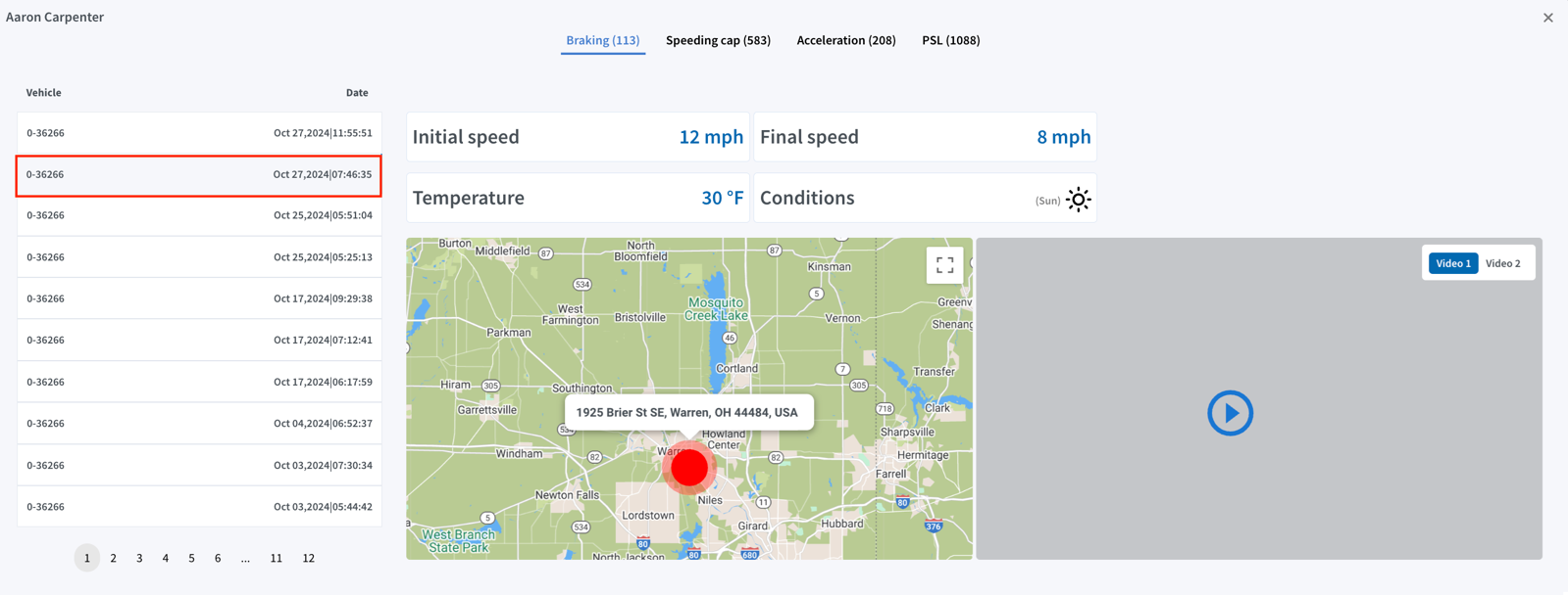
- Event Categories: Events are classified into key types, including Braking, Speeding, Acceleration, and PSL, allowing for quick identification and detailed assessment of each event.
- Event List Panel: Located on the left, this panel displays a chronological list of individual events, including vehicle details, along with the date and time of the events (e.g., Braking in this case).
- Detailed Event View: Selecting an event from the list provides detailed information on the right, including:
- Speed Information: Displays the initial speed (e.g., 12 mph) and final speed (e.g., 8 mph) recorded during the event.
- Weather Conditions: Shows the temperature (e.g., 30°F) and indicates weather conditions, such as clear and sunny, to provide context for the driving environment.
- Map Location: Highlights the event location on a map with an exact address marker (e.g., for a Braking event), aiding in tracking where the event occurred.
- Video Footage: Includes "Video 1" and "Video 2" buttons to access road-facing and driver-facing footage of the selected event.

Insights – Common Trips
Common Trips
The Common Trips feature analyzes fleet travel data to identify frequently observed start and end location pairs, represented by zip codes. These pairs highlight the primary areas where vehicles typically operate without detailing the specific routes taken between these points.
By focusing on start and end locations, this feature provides actionable insights into the fleet’s operational patterns, helping carriers better understand key areas of activity.
Key aspects include:
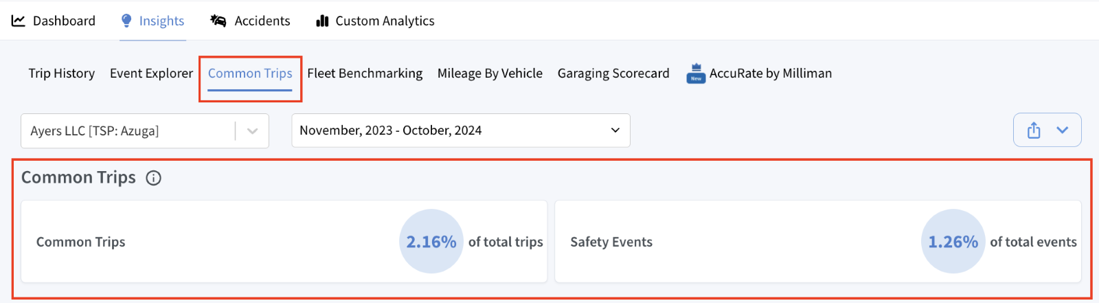
- 2.16% of total trips are identified as "Common Trips," representing frequently observed start and end location pairs within the fleet's operations.
- 1.26% of total events occurring within these common trips are labeled as "Safety Events”, indicating the proportion of incidents involving risky driving behaviors.
Common Trips
Data Table:
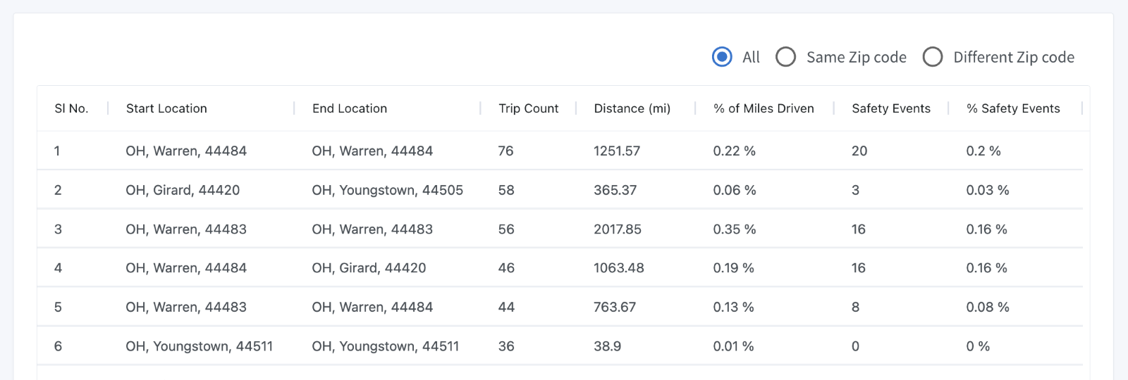
The table provides a structured overview of common trips, organized by columns for easy analysis. It includes filters to distinguish between trips within a single area or across multiple areas.
- Start Location and End Location: Displays the city, state, and zip code for both the starting and ending points of each trip, helping identify frequently traveled areas.
- Trip Count: Indicates the number of trips recorded between the specified start and end locations, providing a measure of trip frequency for specific location pairs.
- Distance (mi): Reflects the total distance covered in miles for the trips between the start and end locations, useful for analyzing trip lengths.
- % of Miles Driven: Indicates the percentage of total miles attributed to each common trip, compared to all recorded trips, helping to identify high-traffic operational areas.
- Safety Events: Lists the number of safety-related incidents (e.g., speeding, hard braking, harsh acceleration) recorded during trips between the start and end points.
- % Safety Events: Displays the percentage of total safety events that occurred on each common trip, useful for comparing safety incident rates across different trip pairs.
Insights – Fleet Benchmarking
Fleet Benchmarking
The Fleet Benchmarking section lets insurers compare a fleet's performance and safety metrics with similar fleets. Insurers can benchmark by fleet size, industry, region, and geography to assess risk and identify areas for improvement. By comparing insured fleets with industry standards helps insurers understand performance levels and make informed decisions to improve fleet safety and efficiency
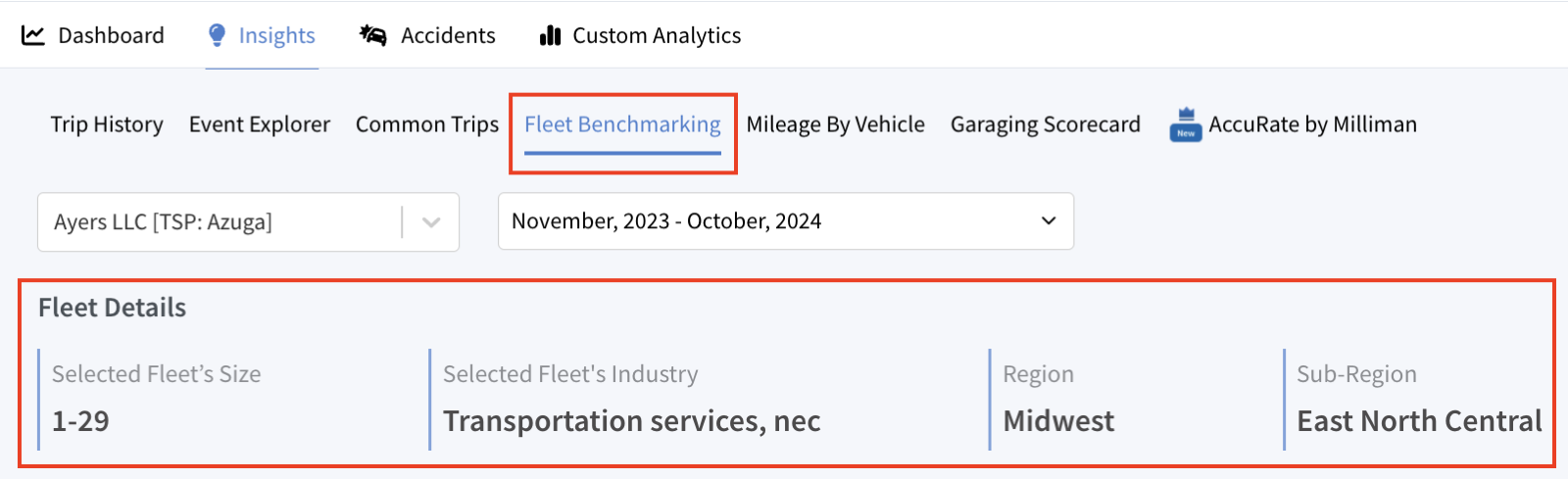
Fleet Details:
This section displays high-level information about the selected fleet and its benchmarking parameters:
- Selected Fleet’s Size: Indicates the fleet size category (in this case, 1–29 vehicles).
- Selected Fleet’s Industry: Shows the industry classification for the selected fleet (e.g., Transportation services, nec).
- Region and Sub-Region: Specifies the geographical region (e.g., Midwest) and sub-region (e.g., East North Central) where the fleet operates.
Fleet Benchmarking
Benchmarking:
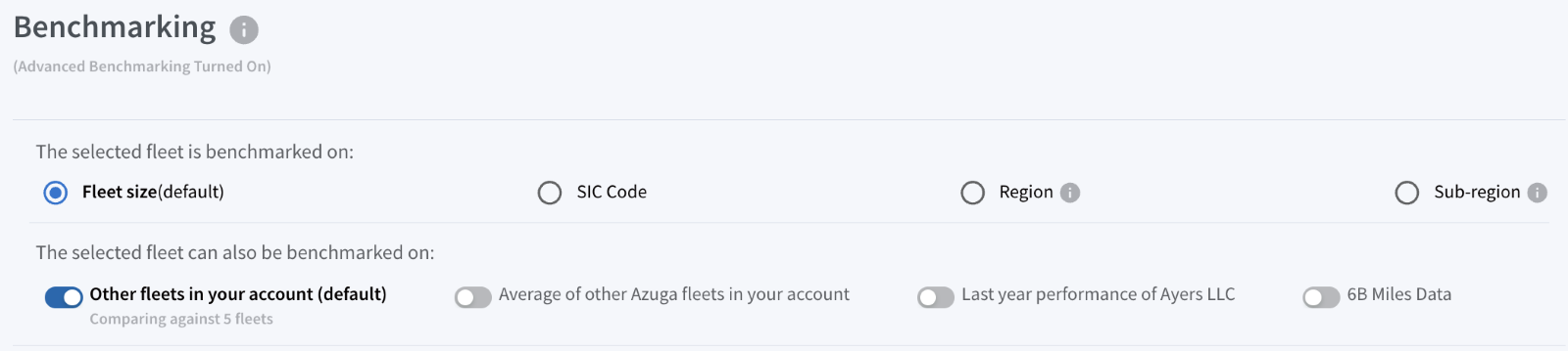
This section allows customization of benchmarking parameters based on different criteria:
- Benchmark Fleet Size (default): Compares fleets of a similar size for relevant comparisons.
- SIC Code: Compares fleets within the same Standard Industrial Classification (SIC) code for industry-specific benchmarking.
- Region or Sub-Region: Enables comparisons with fleets in the same geographic area.
Fleet Benchmarking
Additional benchmarking options include:
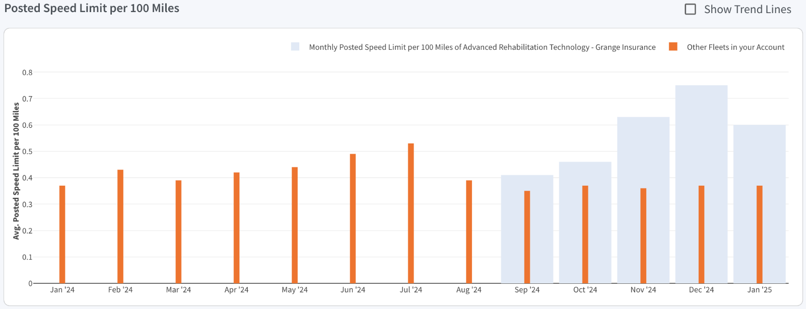
- Other Fleets in Your Account (Default): Compares the selected fleet with other fleets within the same account based on the chosen benchmarking criterion. By default, the comparison is based on Fleet Size. Users can optionally switch the benchmarking criterion to SIC code, region, or sub-region for comparison.
- Average of Other Azuga Fleets in Your Account: Compares the selected fleet with other fleets in the same account that are using the same telematics service provider (TSP), based on the selected benchmarking criterion. Fleet Size is the default criterion. Users can optionally benchmark by SIC code, region, or sub-region if those criteria are selected.
- Last Year Performance: Compares the current performance of the selected fleet against its own performance from the previous year, based on the selected benchmarking criterion. Fleet Size is the default criterion. Users can optionally apply SIC code, region, or sub-region for a more specific comparison if desired.
- 6B Miles Data: Benchmarks the selected fleet’s performance against a broader dataset covering 6 billion miles of Azuga fleet data. By default, benchmarking is based on Fleet Size. Users can optionally choose to benchmark using SIC code, region, or sub-region.
Note:
By default, the options "Fleet Size" and "Other Fleets in Your Account" are pre-selected. Additional benchmarking combinations can be chosen to dynamically update the Fleet Benchmarking values and the trends for events per 100 miles, braking per 100 miles, acceleration per 100 miles, and speeding cap per 100 miles.
Fleet Benchmarking
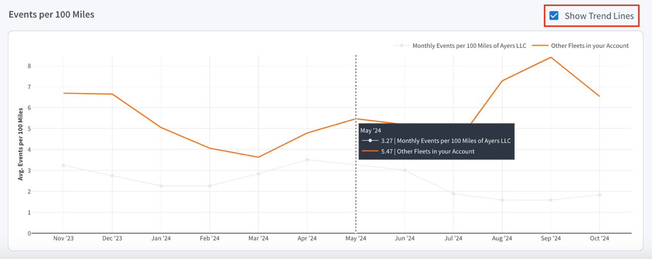
Events/Miles Distribution:
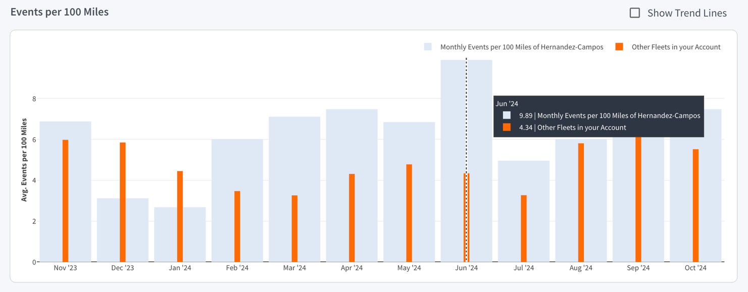
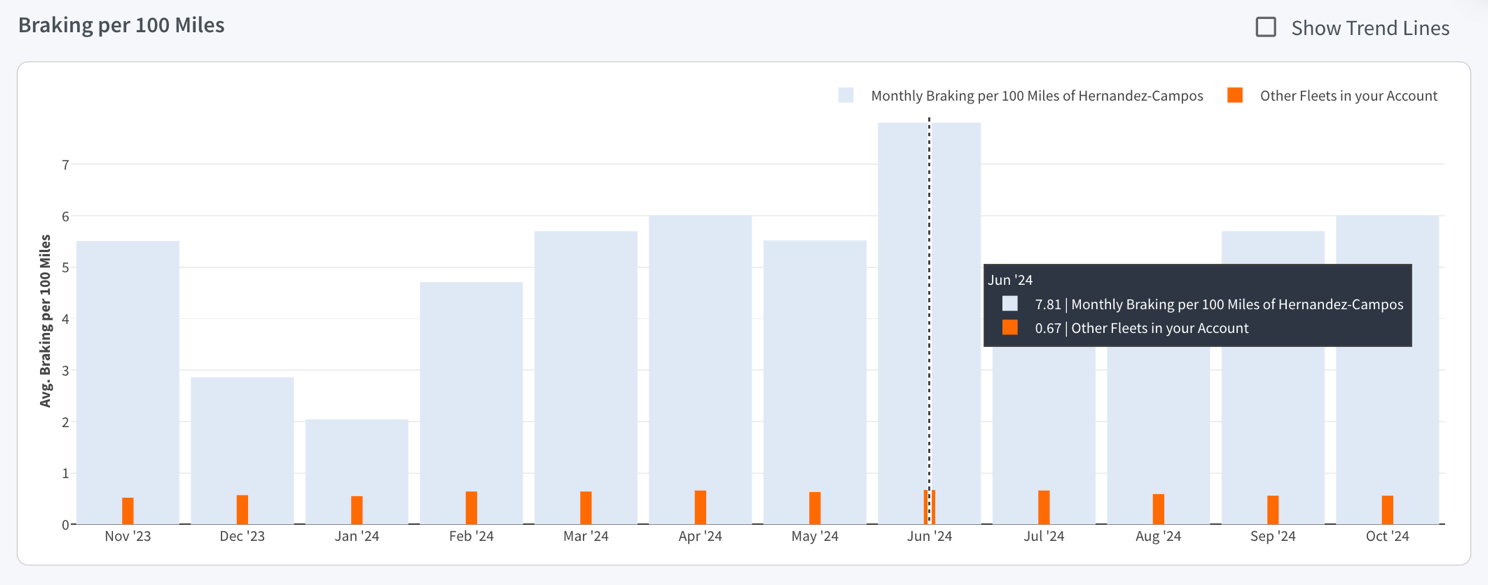
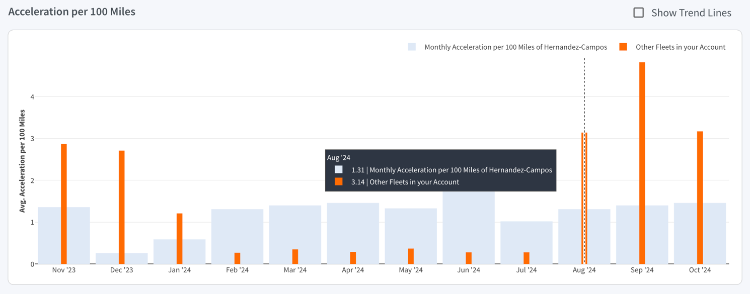
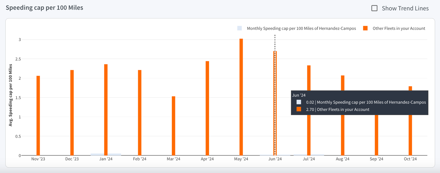
This section visually represents benchmarking trends, comparing insured fleets with other fleet cohorts to facilitate easy trend identification over time. With "Fleet Size" and "Other Fleets in Your Account" pre-selected by default, each graph displays two sets of data:
- Monthly Events per 100 Miles: Shown as blue bars, representing the event data for the selected fleet.
- Other Fleets in Your Account: Shown as orange bars, providing a benchmark for comparison.
Various combinations of benchmarking cohorts can be selected to dynamically display bar graphs. Hovering over these bars reveals the corresponding monthly values. Each graph includes a "Show Trend Lines" option that, when enabled, overlays trend lines to help visualize changes in event frequency over time.
Fleet Benchmarking
Events per 100 Miles:
Braking per 100 Miles:
Acceleration per 100 Miles:
Speeding per 100 Miles:
Fleet Benchmarking
Posted Speed Limit per 100 Miles:
Vehicles Details:
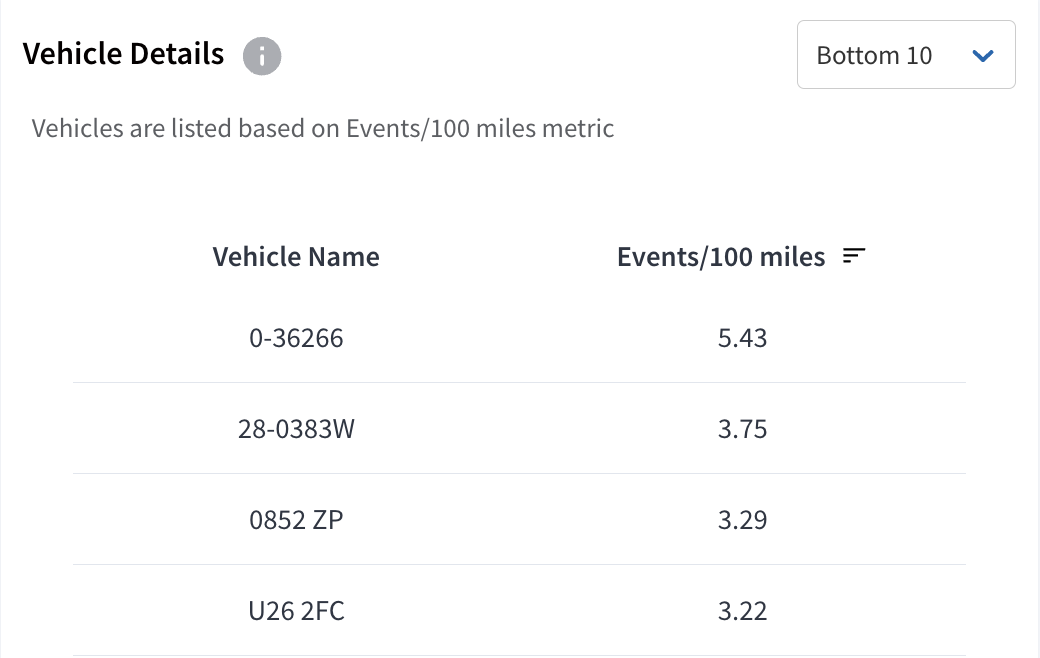
This section lists vehicles with the highest number of events/100 miles, as they elevate fleet risk exposure. By default, the list shows the bottom 10 vehicles, with options to expand it to the bottom 20, 50, or 100 vehicles as needed. The list can also be reordered to suit preferences.
Insights – Mileage By Vehicles
Mileage By Vehicles
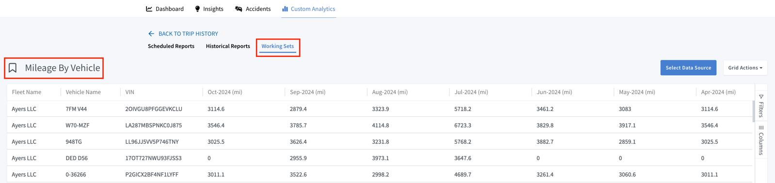
It provides an overview of each vehicle's monthly mileage data in a fleet, enabling insurers to track and analyze usage intensity effectively. By tracking and comparing mileage across vehicles, insurers can evaluate performance trends over time, supporting better decisions in fleet management and maintenance planning.
Note: Accessing "Mileage by Vehicles" navigates to the Custom Analytics section, featuring it as one of the datasets while allowing exploration of other data sets for detailed analysis.
Under Mileage by Vehicle, the table includes the following:
- Fleet Name: Lists the name of the fleet, representing the service provider associated with the vehicle.
- Vehicle Name: Shows the name of the vehicle
- VIN: It contains a unique identifier for each vehicle in the fleet.
- Monthly Mileage Column: It Shows the monthly mileage for each vehicle over the last 12 months (Nov 2023 – Oct 2024).
Mileage By Vehicles
Note:
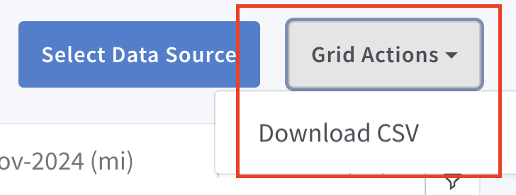
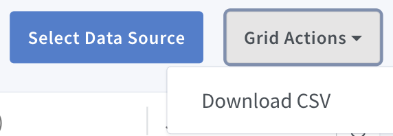
Columns can be rearranged within the table and sorted as needed. Additionally, data can be filtered based on preferences and downloaded in CSV format from the “Grid Actions” menu.
Filter Selections:
This page offers a variety of filter options, enabling targeted analysis of specific fleets or vehicle groups.
These filters allow users to customize and refine data to suit their needs. Simply open the Filters menu, configure the desired conditions, and apply them.
- Column Overview: Filters are located next to each column header. Hovering over a column header reveals a hamburger icon, which expands to show more options when clicked.
- Select Data Source: This filter enables exploration of additional datasets under “Custom Analytics”, including “Mileage by Vehicles”, offering a more detailed overview across various datasets.
- Filters & Columns: Use these filters to narrow down the data. Select the desired options to tailor the displayed information. Through the “Columns” filter, data fields can be dragged and dropped into the rows and values fields.
Insights – Garaging Scorecard
Garaging Scorecard
The Garaging Scorecard provides detailed insights into vehicle garaging patterns within a fleet over a selected period, helping insurers assess exposure to risks like theft, vandalism, and environmental damage. By analysing vehicle stop events exceeding a configurable threshold of 8 hours, it identifies "garaging events" and evaluates potential claims risk. This data enables insurers to make informed decisions on premium adjustments and risk management.
Regulations and Alerts in Garaging Scorecard:
In addition to identifying garaging events, the Garaging Scorecard currently supports Regulations and Alerts for enhanced risk management. At present, one regulation is available — the Operating Radius Violation Regulation.
This allows insurers to define a permitted operating radius around a vehicle’s policy location. If a vehicle exceeds this configured distance, it triggers a violation alert, helping insurers monitor unauthorized movements and enforce location-based risk policies.
Note: As of now, this regulation is selectively implemented and has been enabled for limited customers.
Key Metrics of Garaging Scorecard:
When accessing the Garaging Scorecard, you will find the following two key metrics:
- Total Garaging Events: Shows the total number of garaging events recorded during the selected period. Each event represents a vehicle parked or stationed at a location for more than 8 hours.
- Total Garaging Locations: Indicates the number of unique locations where vehicles were garaged for over 8 hours during the selected period.

Garaging Scorecard
Vehicle Garaging Locations :
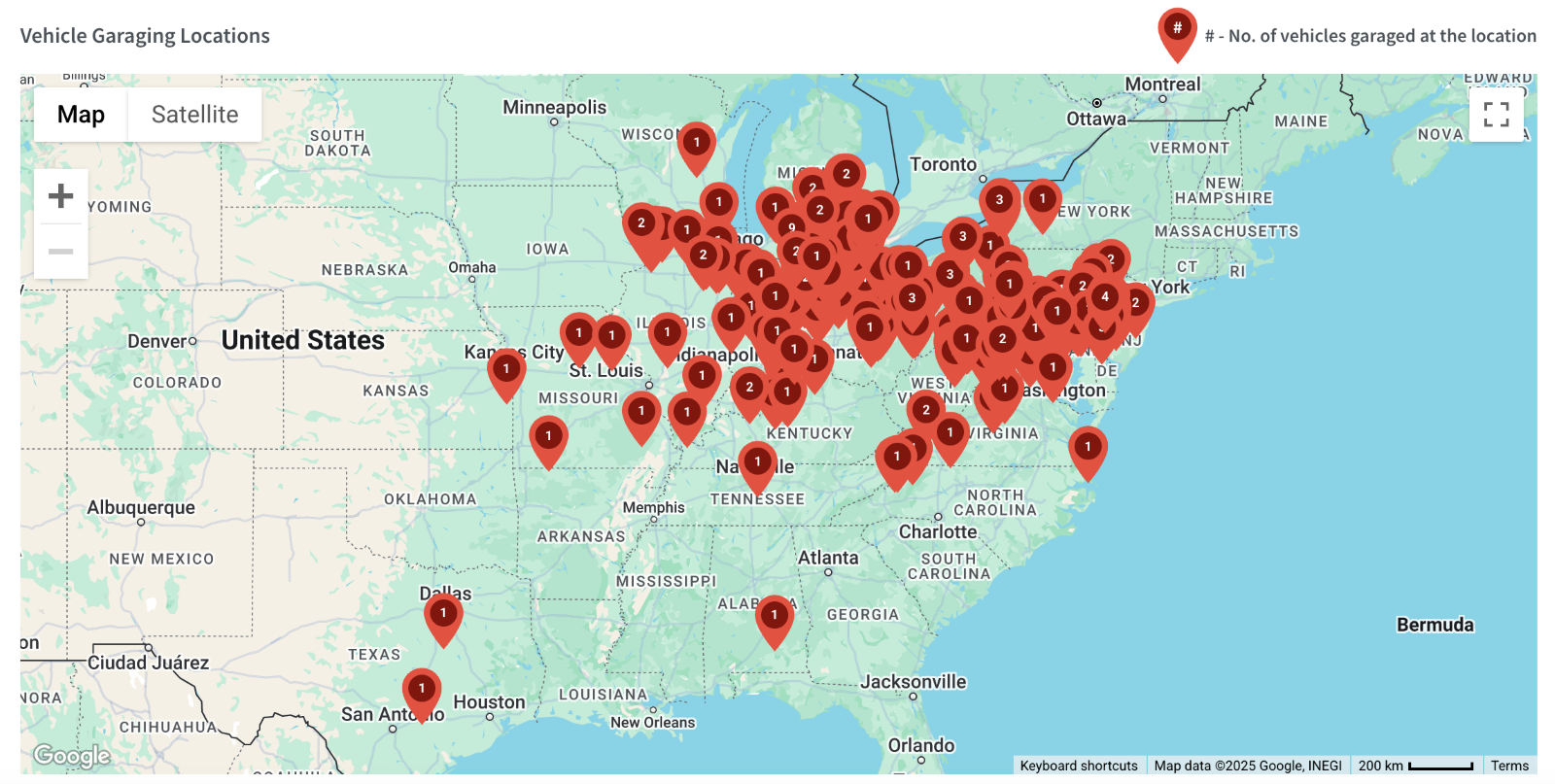
- The map provides a geographical visualization of garaging locations. Each red pin on the map indicates the number of vehicles garaged at a specific location, helping to identify high-activity garaging spots.
- The map supports zooming and panning, allowing detailed examination of specific regions or locations.
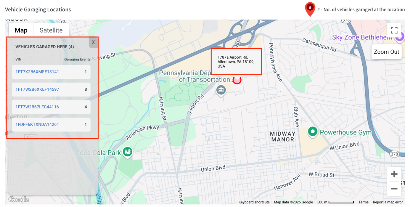
- Clicking on a red pin displays additional information, including the location address, a list of vehicle VINs garaged there, and the number of garaging events for each VIN.
Garaging Scorecard
Vehicle Garaging Details:
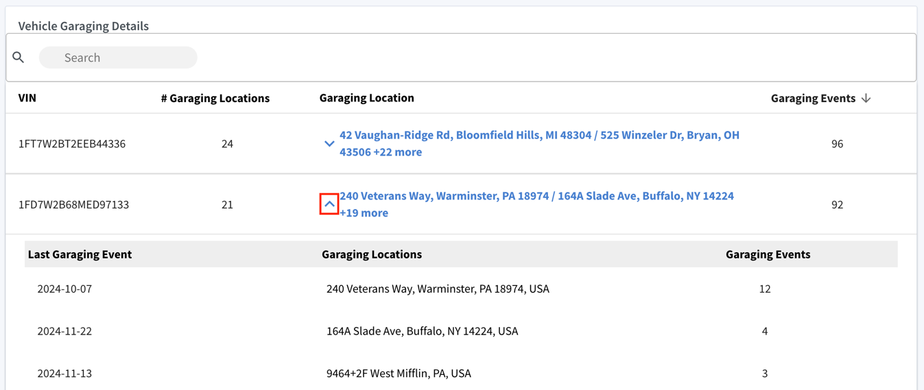
Below the map, a detailed Vehicle Garaging Details table provides granular insights into garaging events for each vehicle in the fleet. The search bar can be used to quickly locate specific vehicles. The table includes the following sections:
- VIN: Displays the unique VIN for each vehicle in the fleet.
- # Garaging Locations: Indicates the number of distinct locations where the vehicle has been garaged during the selected period. For example, a vehicle might have been garaged in 15 different locations.
- Garaging Location(s): Lists the addresses of garaging locations where the vehicle has been parked. For vehicles with multiple locations, a preview is shown with an option to expand the full list.
- Garaging Events: Shows the total number of garaging instances for the vehicle during the selected period. Sort the column to view vehicles with the least or most events, along with other details in the table.
Insights – Advanced Garaging Scorecard
Advanced Garaging Scorecard
The Advanced Garaging Scorecard analyses vehicle garaging patterns by comparing recorded events to carrier-defined "policy locations" where vehicles are expected to park. Any events outside these policy locations are flagged as exceptions, highlighting potential risks like theft or unauthorized use.
This information helps insurers assess risk exposure more accurately, adjust premiums based on actual garaging patterns, and pinpoint potential vulnerabilities that could result in future claims.
Key Metrics:
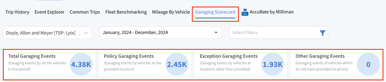
When accessing the Advanced Garaging Scorecard, you will find the following four key metrics:
1. Total Garaging Events:
The total number of garaging instances recorded for all vehicles in the selected period.
2. Policy Garaging Events: Instances where vehicles were garaged at the designated, policy-compliant locations.
3. Exception Garaging Events: Instances where vehicles were garaged at locations other than the designated ones, indicating non-compliance with policy.
4. Other Garaging Events:
Represents cases where garaging occurred but no specific location was provided. For this dataset, this value is zero.
Advanced Garaging Scorecard
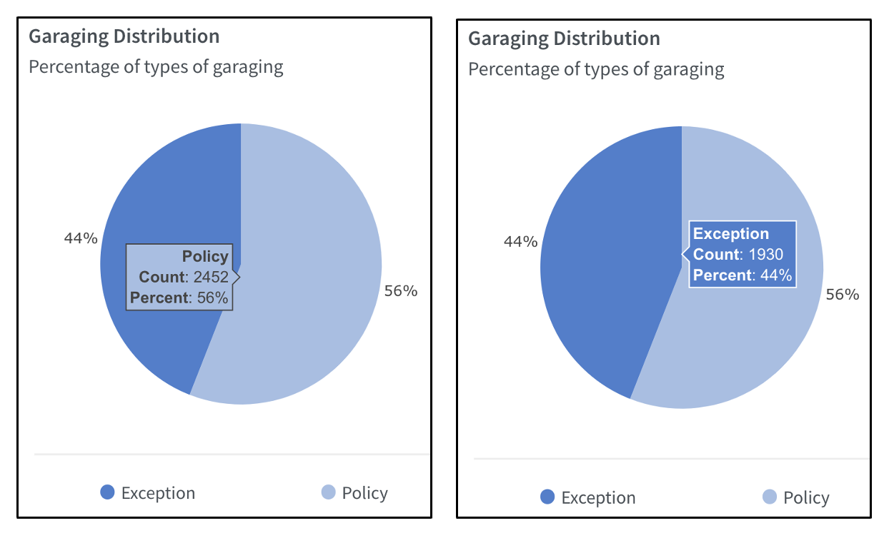
Garaging Distribution (Pie Chart):
The pie chart visually represents the proportion of Policy and Exception garaging events, using distinct colour codes for easy identification:
- Exception Garaging: 44%
- Policy Garaging: 56%
Hovering over each section of the pie chart displays the detailed count and percentage:
- Policy: Count = 2452, Percent = 56%
- Exception: Count = 1930, Percent = 44%
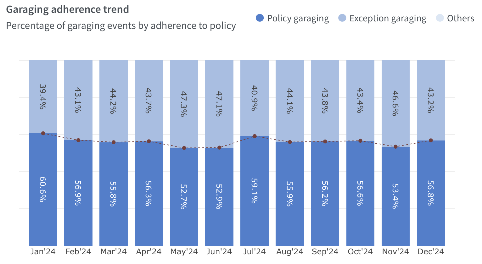
Garaging Adherence Trend (Bar Chart):
Tracks the percentage of Policy and Exception garaging events over time, represented in a bar chart with a monthly breakdown:
- Policy Garaging: Displayed in dark blue bars
- Exception Garaging: Displayed in light blue bars
A red dotted line across the bars highlights the trend of garaging events' adherence to policy over the months.
Advanced Garaging Scorecard
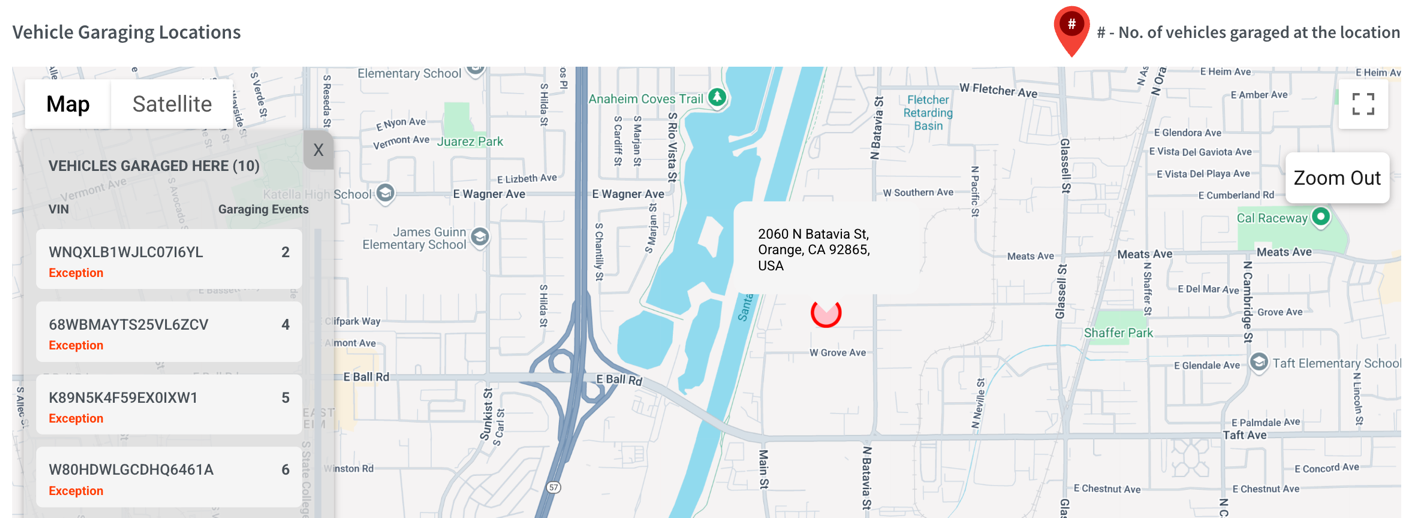
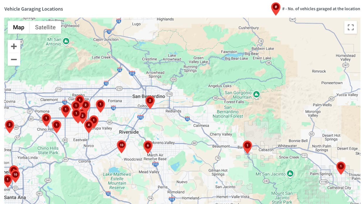
Vehicle Garaging Locations:
- The map provides a geographical visualization of garaging locations. Each red pin on the map indicates the number of vehicles garaged at a specific location, helping to identify high-activity garaging spots.
- The map supports zooming and panning, allowing detailed examination of specific regions or locations.
- Clicking on a red pin displays additional information, including
- The location address
- A list of VINs garaged at that location, indicating whether each is classified as an exception or policy.
- The number of garaging events associated with each VIN.
Advanced Garaging Scorecard
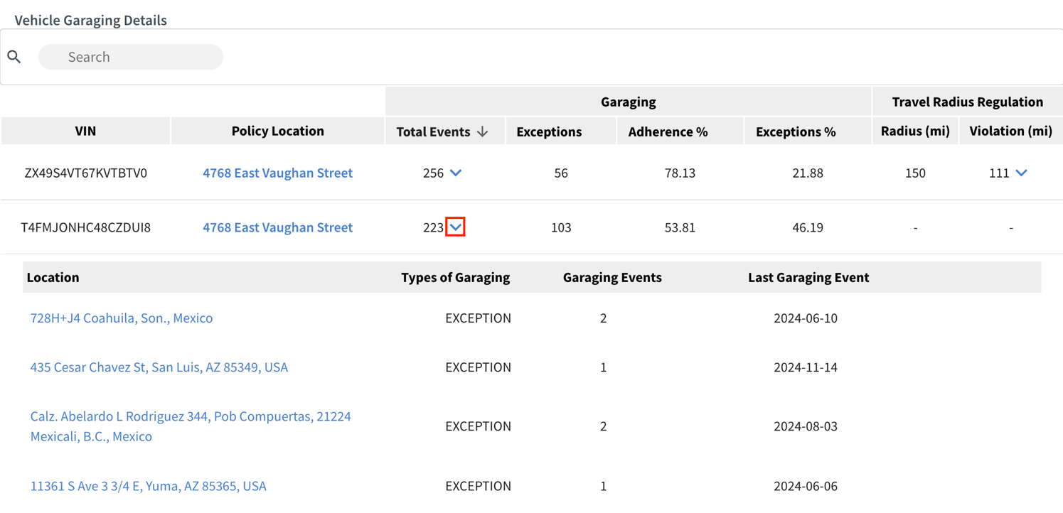
Vehicle Garaging Details:
Below the map, a detailed Vehicle Garaging Details table provides a breakdown of garaging activity for individual vehicles in the fleet. It highlights policy adherence, exceptions, and travel radius compliance for specific VINs.
The search bar can be used to quickly locate specific vehicles. The table includes the following sections:
- VIN: Displays the unique VIN for each vehicle in the fleet.
- Policy Location: The designated carrier-defined garaging address for the vehicles.
- Garaging Details: Provides a summary of garaging activity for the vehicle:
- Total Events: The total number of garaging instances recorded.
- Exceptions: The number of instances where the vehicle was garaged outside its policy location.
- Adherence%: The percentage of garaging events that complied with the policy location.
- Exceptions%: The percentage of garaging events that were non-compliant (exceptions).
- Total Events Breakdown: Clicking the dropdown arrow provides the following details:
- Location: The specific address where the garaging event occurred.
- Types of Garaging: Indicates whether the event was Policy (compliant) or Exception (non-compliant).
- Garaging Events: The total number of garaging instances at the location.
- Last Garaging Event: The most recent date a vehicle was garaged at the location.
Advanced Garaging Scorecard
- Travel Radius Regulation: Defines a geographical limit (measured in miles) within which a vehicle must operate relative to its policy location. In this case:
- Radius (mi): Specifies the maximum allowed travel radius (150 miles) from the policy location that a vehicle can travel without violating the regulation.
- Violation (mi): Indicates the extent to which the vehicle has exceeded the allowed travel radius. Here, the violation is 111 miles, meaning the vehicle travelled 111 miles beyond the 150-mile radius.
- Violation Breakdown: Clicking the dropdown arrow for “Violation” displays the following details:
- Violated Distance: Lists the specific distances by which the vehicle exceeded the allowed radius during events.
- Maximum Distance from Policy Location: Shows the furthest distance recorded from the policy location for the vehicle during any event.
Insights – AccuRate by Milliman
AccuRate by Milliman
The AccuRate by Milliman section provides insights into the risk scores of insured vehicles within the fleet. This section uses actuarial data to evaluate the vehicle safety performance, categorizing them into risk deciles and offering a breakdown of scores and trends over time.
The dashboard includes three primary components:
- Insured Vehicle AccuRate Score
- Milliman AccuRate Actuarial Score
- Distribution by AccuRate Score by vehicle
Each component provides distinct insights and tools to support the evaluation of vehicle safety and performance.
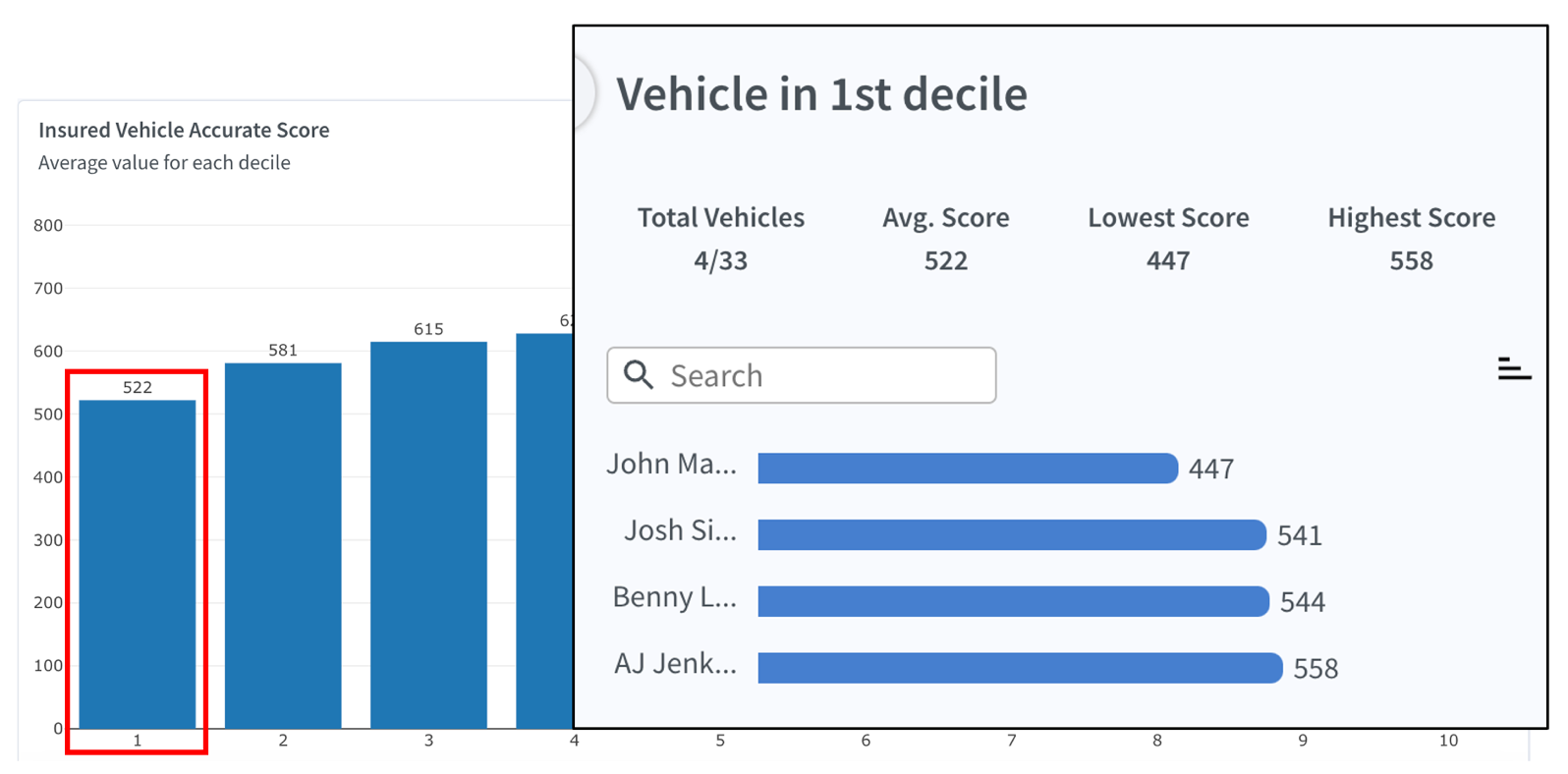
Insured Vehicle AccuRate Score:
This bar chart displays the average risk score for each decile (1-10), where:
- 1 represents the lowest scores (highest risk).
- 10 represents the highest scores (lowest risk).

AccuRate by Milliman
The scores are calculated as an average value for all vehicles in each decile. This allows insurers to quickly identify patterns, such as the overall distribution of high-risk and low-risk vehicles.
Clicking on any bar in this chart opens a detailed side panel that provides a breakdown of all vehicles in the selected decile, including:
- Total Vehicles: The Total Vehicles value is displayed as a ratio (e.g., 4/33), where:
- 4: Number of vehicles in the selected decile.
- 33: Total vehicles in the fleet.
- This helps insurers understand the proportion of vehicles in a specific risk category compared to the entire fleet.
- Average Score: The average AccuRate score among vehicles in this decile.
- Lowest Score: The lowest score among vehicles in this decile.
- Highest Score: The highest score among vehicles in this decile.
Individual vehicles are listed along with their specific AccuRate scores, making it easy to identify which vehicles contribute to the decile's score. The list is searchable and can be sorted for convenience.
AccuRate by Milliman
Milliman Accurate Actuarial Score:
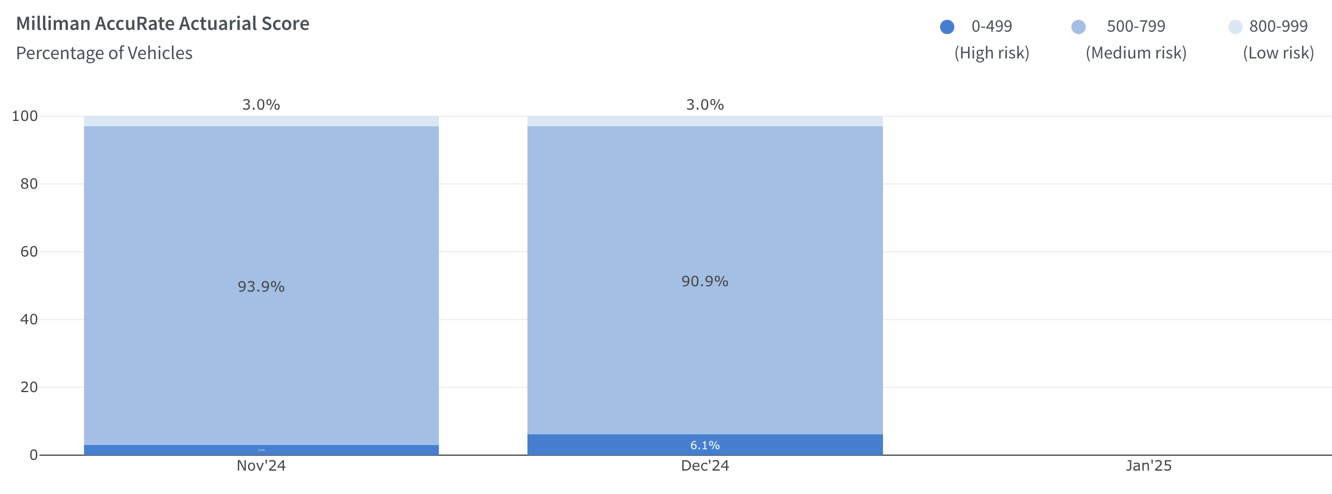
This stacked bar chart illustrates the percentage distribution of vehicles across three risk categories over time, based on their scores.
- High Risk (0–499): Represented by the darkest shade, this group includes vehicles with the highest risk scores, requiring more attention for risk mitigation.
- Medium Risk (500–799): Represented by a medium shade, this tier includes vehicles with moderate risk scores, balancing caution and stability.
- Low Risk (800–999): Represented by the lightest shade, this group includes vehicles with the lowest risk scores, indicating safer performance.
The x-axis represents time (months), and the y-axis shows the percentage of vehicles in each risk category.
AccuRate by Milliman
How It Helps:
- The visualization provides a clear overview of the fleet’s risk distribution at different time intervals (monthly).
- It allows carriers to monitor shifts in risk categories, such as improvements in fleet safety or increases in high-risk vehicles.
- Insights from these trends can guide decisions on premium adjustments, safety programs, or risk reduction strategies.
The chart is a valuable tool for identifying patterns and making data-driven decisions to manage fleet risk effectively.
Distribution by AccuRate Score by Vehicle:
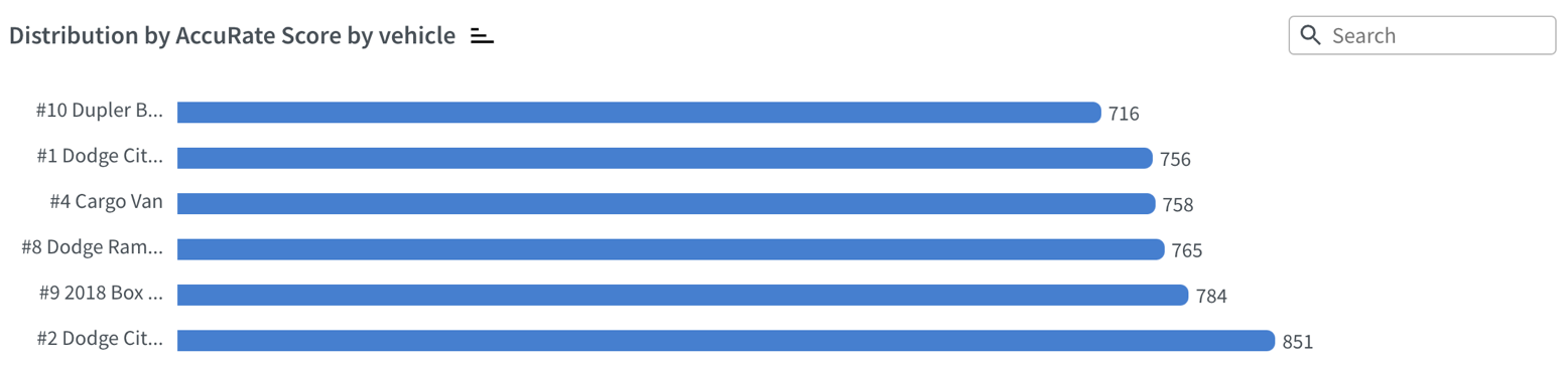
This horizontal bar chart displays individual vehicles along with their specific AccuRate scores, where:
- Each bar represents a vehicle, identified by its unique identifier
- Scores are displayed numerically next to each bar for clarity.
- Use the search bar to find a specific vehicle quickly, with sorting options available for added convenience.
Accidents
Accidents
The Accident section highlights the accident-related data for a fleet. For carriers, it serves as a valuable tool for tracking accidents, near-miss events, and potential accidents based on telematics data. This insight helps in assessing risk, improving safety protocols, and managing claims more effectively, ultimately contributing to better decision-making and reducing future incidents.
Filter Selections:
Located just below the navigation bar, this section allows users to filter and customize the displayed accident data. Key components include:
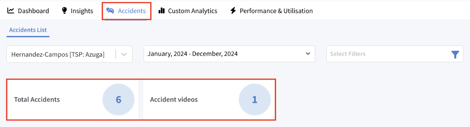
- Fleet Selector Dropdown: Allows users to choose the fleet for which they want to view accident data. In this example, the fleet "Hernandez-Campos [TSP: Azuga]" is selected.
- Date Range Selector: Lets users specify the time period for the data. Options include filters for the last month, last three months, last quarter, past 12 months, or year to date.
- Custom Filter: This filter offers additional options to refine and customize the data, such as by Drivers, Vehicles, VINs, and Video availability.
Key Metrics:
Key metrics provide quick insights into accident data:
- Total Accidents: Displays the total number of recorded accidents for the selected fleet and time period.
- Accident Videos: Shows the number of accidents with associated video footage available for review.
Accidents List Table:
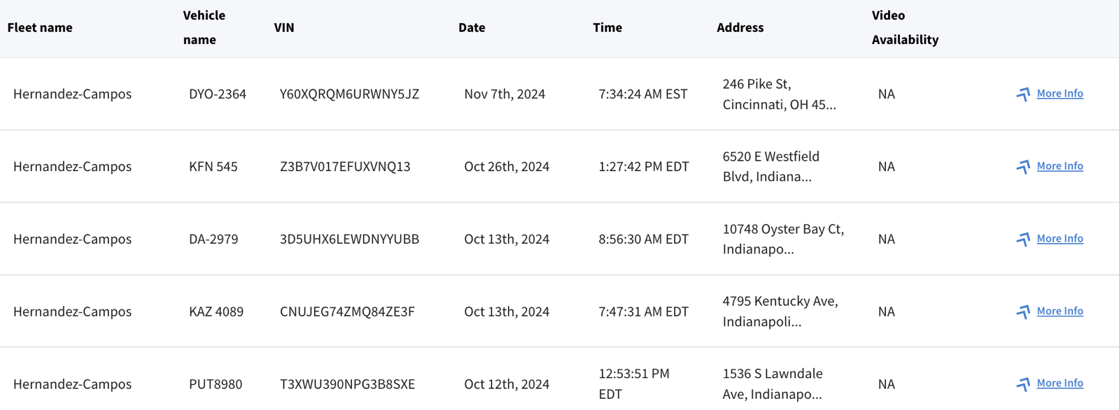
This table displays a detailed breakdown of all recorded incidents for the selected fleet, allowing users to analyse the events systematically. This data table includes the following columns:
- Fleet Name: Identifies the fleet associated with the recorded incident (e.g., Hernandez-Campos).
- Vehicle Name: Displays the unique identifier or name assigned to the vehicle involved in the incident.
- VIN: Shows the unique VIN of the vehicle.
- Date & Time: Specifies the date and exact time of the accident along with the time zone when the accident occurred.
- Address: Specifies the location where the accident occurred.
- Video Availability: Indicates whether video footage of the accident is available for review.
- NA: Video not available
- Available: Video available
- More info: Clicking on the “more info” link provides access to additional details of the accident.
Viewing Detailed Accident Information:
Clicking More Info opens the detailed Accident Insights screen. Below is an explanation of each section.
Accident Summary:
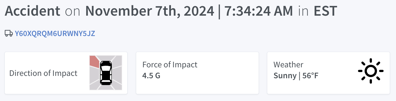
At the top of the screen, key details of the accident are summarized:
- Date and Time: Precise timestamp of the event.
- Vehicle VIN: The vehicle’s unique identification number.
- Direction of Impact: A visual representation showing where the vehicle was impacted.
- Force of Impact: Measured in G-forces to indicate the severity of the collision.
- Weather Conditions: Weather at the time of the accident, e.g., sunny, rainy.
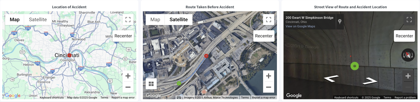
Location of Accident:
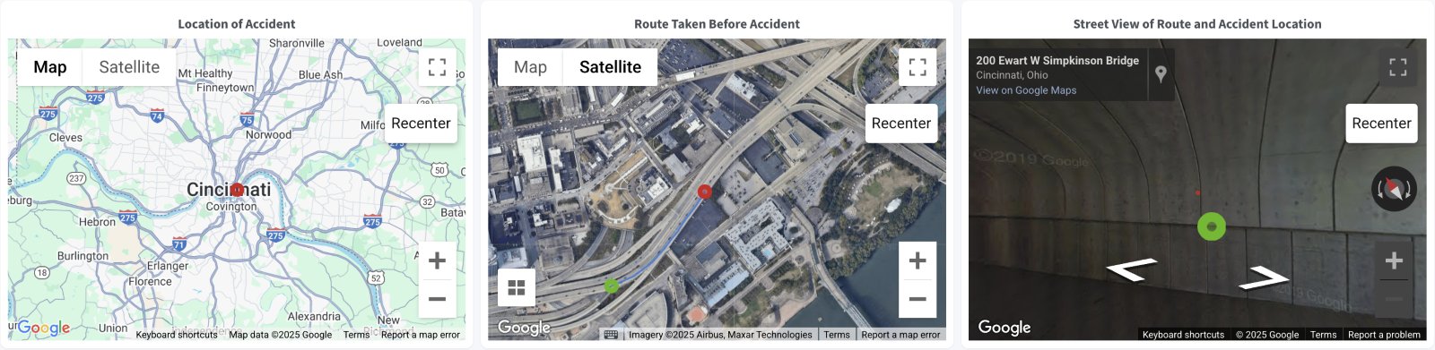
- Displays the exact location of the accident using a Google Maps interface.
- Provides the ability to toggle between Map and Satellite views for different perspectives.
- Users can also zoom, pan, toggle the full-screen view, or recentre the map, enabling a detailed examination of the accident location.
Route Taken Before Accident:
- Highlights the vehicle’s route leading up to the accident.
- Users can switch between Map and Satellite views for different perspectives.
- Users can also zoom, pan, rotate, tilt, toggle the full-screen view, or recentre the map, enabling a detailed examination of the accident route.
Street View of Route and Accident Location:
- Provides a Google Street View visualization of the accident’s location.
- Use the navigation controls to explore the surrounding area.
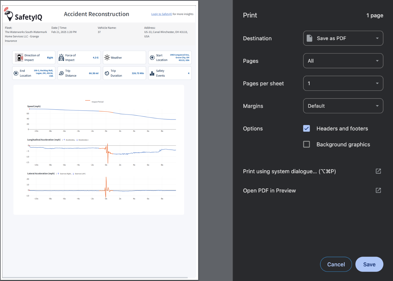
Replay of Accident:
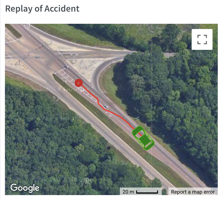
This section provides a visual and data-driven replay of the accident.
- Trajectory Map:
- Shows the vehicle’s movement and final position during the accident.
- A red marker indicates the point of collision.
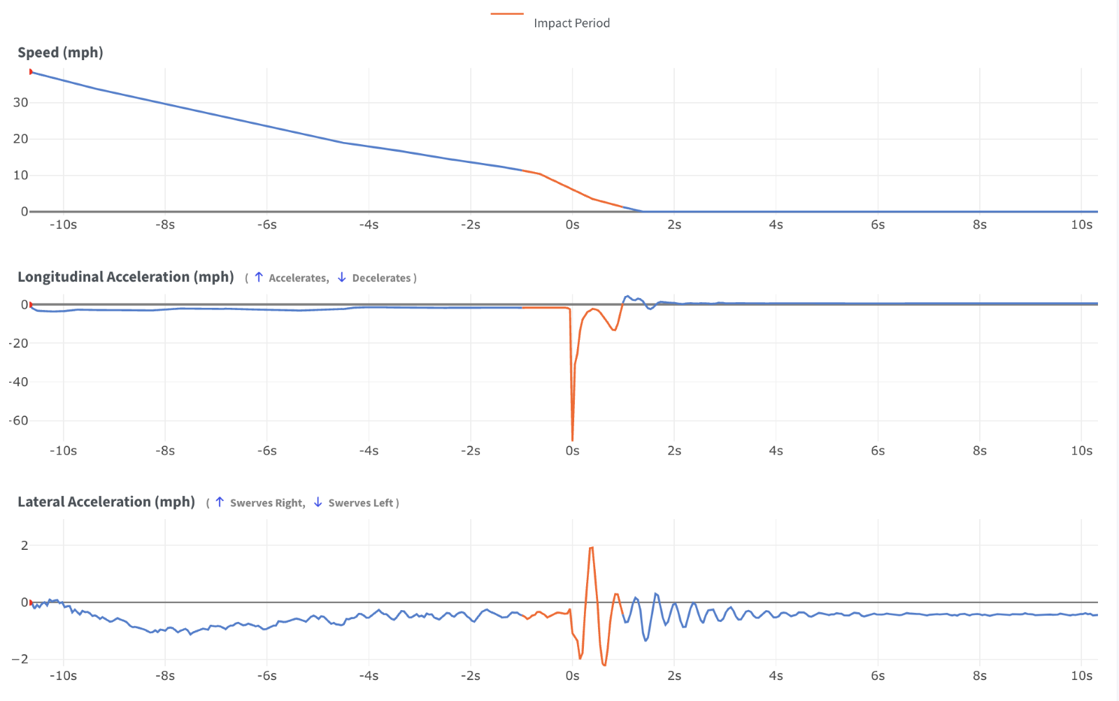
- Graphs:
- Speed (mph):
- A line graph that illustrates the vehicle’s speed before, during, and after the impact period.
- A red line on the graph highlights the impact period.
- Longitudinal Acceleration (mph):
- Positive values: Acceleration.
- Negative values: Deceleration.
- The impact period is highlighted by a red line on the graph for better visualization and easier analysis.
- Lateral Acceleration (mph):
- Positive values: Swerves to the right.
- Negative values: Swerves to the left.
- The impact period is highlighted by a red line on the graph to indicate the collision moment.
- Video Replay (if available):
- A synchronized video replay of the accident.
- Use playback controls to pause, play, or replay.

Accidents – Export & Trip Details
Accidents
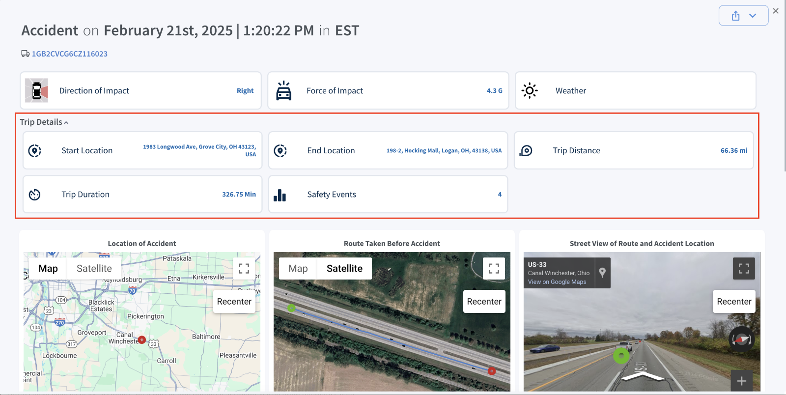
The Accident Module has been enhanced with two new features: an Export option for accident reports in PDF format and a Trip Details section. This section provides valuable insights, including Start & End Locations, Trip Distance & Duration, and Safety Events, aiding in more effective accident analysis.
The Accident Module now includes two key enhancements:
- Export Option for Individual Accident Reports:
Users can now export accident reports in PDF format for printing or sharing. The Export button, available in the Accident section, simplifies access and distribution.

Accidents
- Trip Details Display for Accident Events
- Users can now view Trip Details for accident events. By default, this section remains collapsed, but users can expand it by clicking the down arrow for a more detailed accident analysis.
- The Trip Details section includes:
- Start & End Locations
- Trip Distance & Duration
- Safety Events
Custom Analytics
Custom Analytics
The Custom Analytics section provides users with tools to generate, manage, and analyse reports tailored to specific operational needs. This feature allows for a deeper understanding of fleet data and performance through scheduled reporting, historical insights, and working datasets.
The section is divided into three key subsections:
- Scheduled Reports
- Historical Reports
- Working sets
Custom Analytics – Scheduled Reports
Scheduled Reports
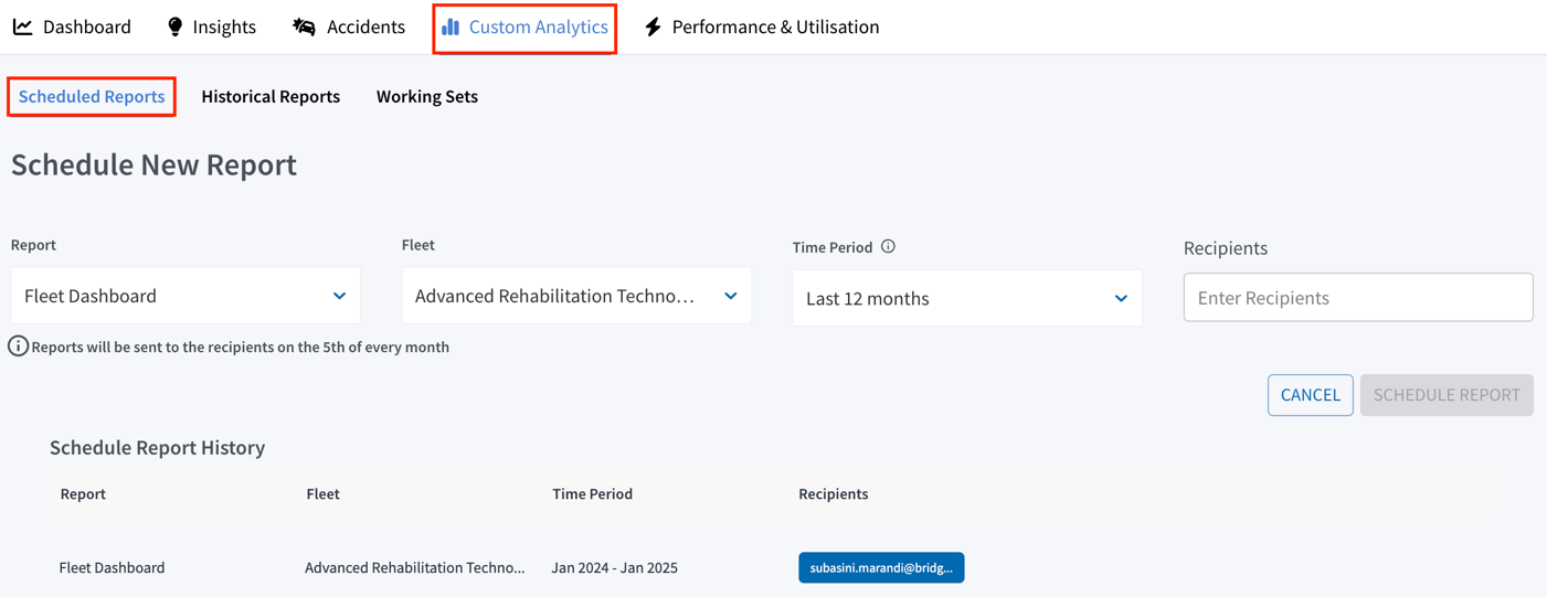
Scheduled Reports:
Scheduled Reports enable users to automate the delivery of reports at regular intervals, providing timely insights without the need for manual intervention.
Key Features:
- Report Type: Select a predefined report from the dropdown menu, such as the Fleet Dashboard, Program Dashboard, etc.
- Fleet Selection: Choose the fleet for which the report will be generated. as needed.
- Time Period: Specify the date range for the report, such as the last month or the last 3, 6, or 12 months.
- Recipients: Enter recipient email addresses to distribute the reports automatically. Reports are sent to recipients on the 5th of every month.
- Schedule Report History: View a history of all scheduled reports, including details such as the report name, fleet, time period, and recipient information. Scheduled reports can be edited or deleted
Custom Analytics – Historical Reports
Historical Reports
Historical Reports:
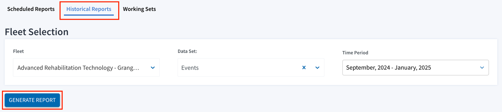
The Historical Reports offers access to previously generated reports, providing an archive of fleet data for analysis and record-keeping.
- Fleet Name: Select the desired fleet from the dropdown menu to filter the reports.
- Data Set: Choose specific datasets such as Events, Trips, or Vehicles. A “Select all” option is also available for comprehensive reporting.
- Time Period: Define the timeframe for the data to retrieve reports within a specific date range. Options include last month, last three months, last quarter, last 12 months, and year-to-date.
Filter Selection:
Once the filter selection is done, click the “Generate Report” button to generate the report.
Historical Reports
Report Generation Process:
After clicking “Generate Report”, a pop-up window will appear to notify you that your report is being processed.
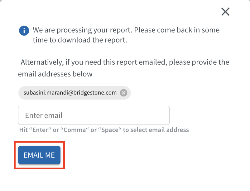
- Notification: The system displays the message, “We are processing your report. Please come back in some time to download the report.” This confirms that the report is currently being prepared.
- Email Option: Alternatively, if you would like the generated report sent to your email, enter one or more email addresses in the input field.
- Enter the email address and hit Enter, Comma, or Space to add it to the list.
- Once all required email addresses are entered, click “Email Me” to receive the report via email.
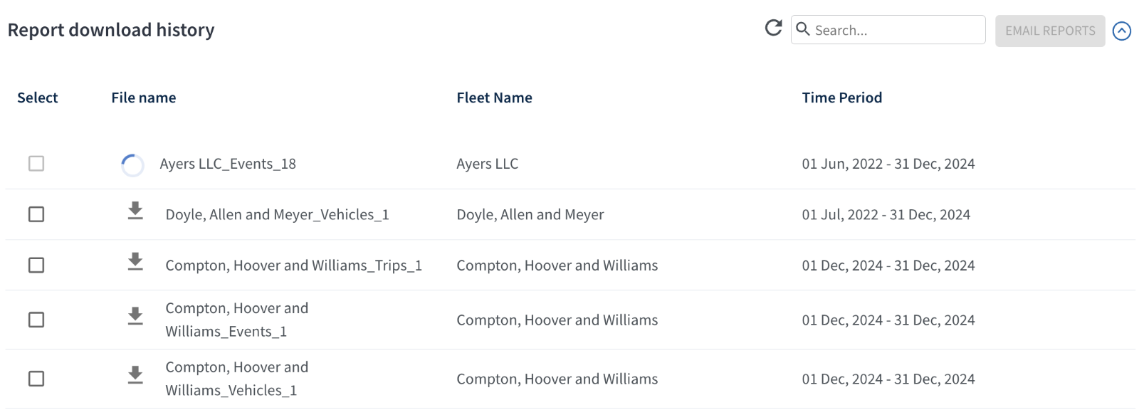
Report Download History:
Previously generated reports can be accessed and downloaded individually from this section. To email selected reports, choose the desired report(s), click “Email Reports”, and enter the recipient's email address.
This streamlined workflow allows you to efficiently generate and retrieve historical reports, either by downloading them directly or receiving them via email.
Custom Analytics – Working Sets
Working Sets
The Working Sets subsection enables users to interact with specific datasets tailored to their analytical needs, offering in-depth insights and flexibility for data exploration.
Key Features:
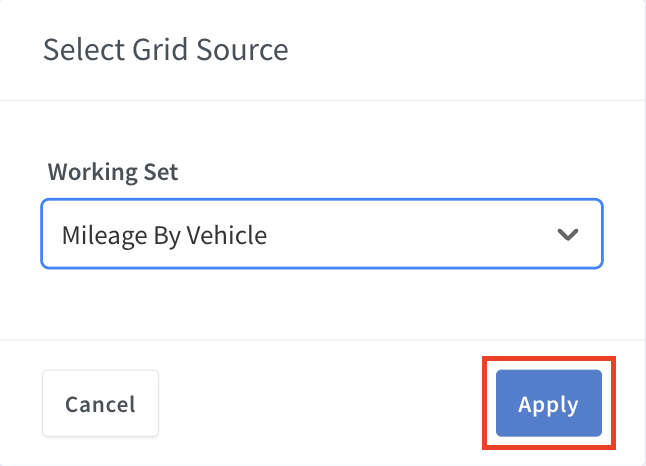
- Working Set Selection: Select a pre-configured working set from the dropdown menu and apply it. The selected working sets will be displayed in the table, showing all relevant details.
Note: Table columns can be rearranged and sorted as required for a customized view.
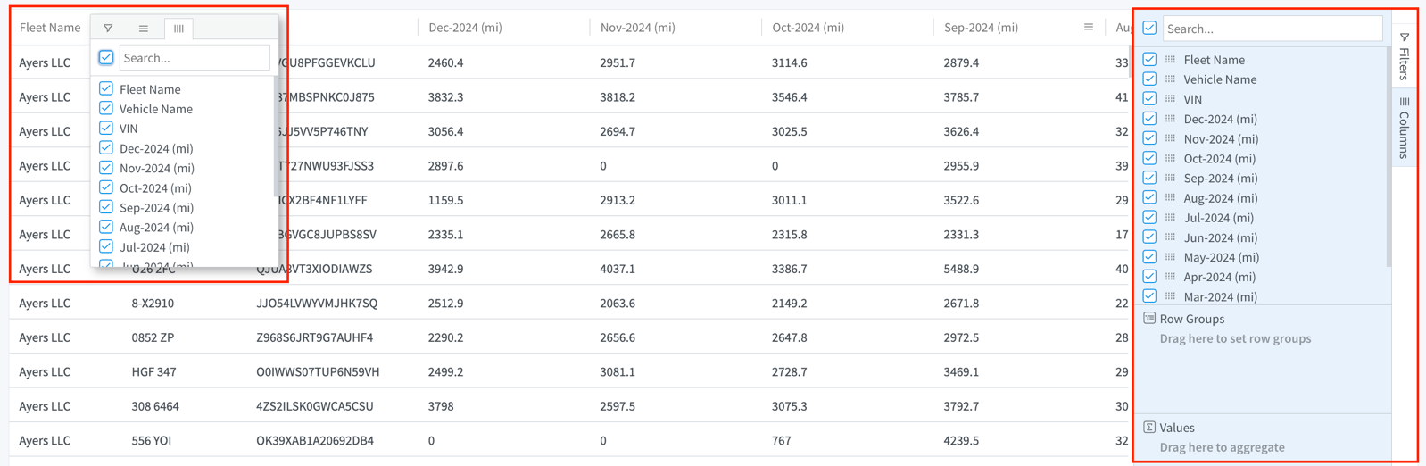
- Filters: Every data set offers a variety of filter options, enabling targeted analysis of specific fleets or vehicle groups. Access the Filters menu, configure the required conditions, and apply them for refined results.
- Column Filters: Filters can be applied directly within the table, located next to each column header. Hover over a column header to reveal a hamburger icon, which expands to display additional options.
- Filters & Columns Panel: Located on the right side of the table, this panel allows users to further refine the displayed data. Use filters to customize the dataset and tailor the information shown. The Columns filter enables users to drag and drop data fields into rows and values for advanced customization.
Working Sets
- Select Data Source: Enables exploration of additional working sets and provides flexibility to switch between them, allowing users to focus on task-relevant data and gain a more detailed overview.
- Grid Actions: Download datasets in CSV format directly from the interface, enabling seamless offline analysis.
Performance & Utilization
Performance & Utilization
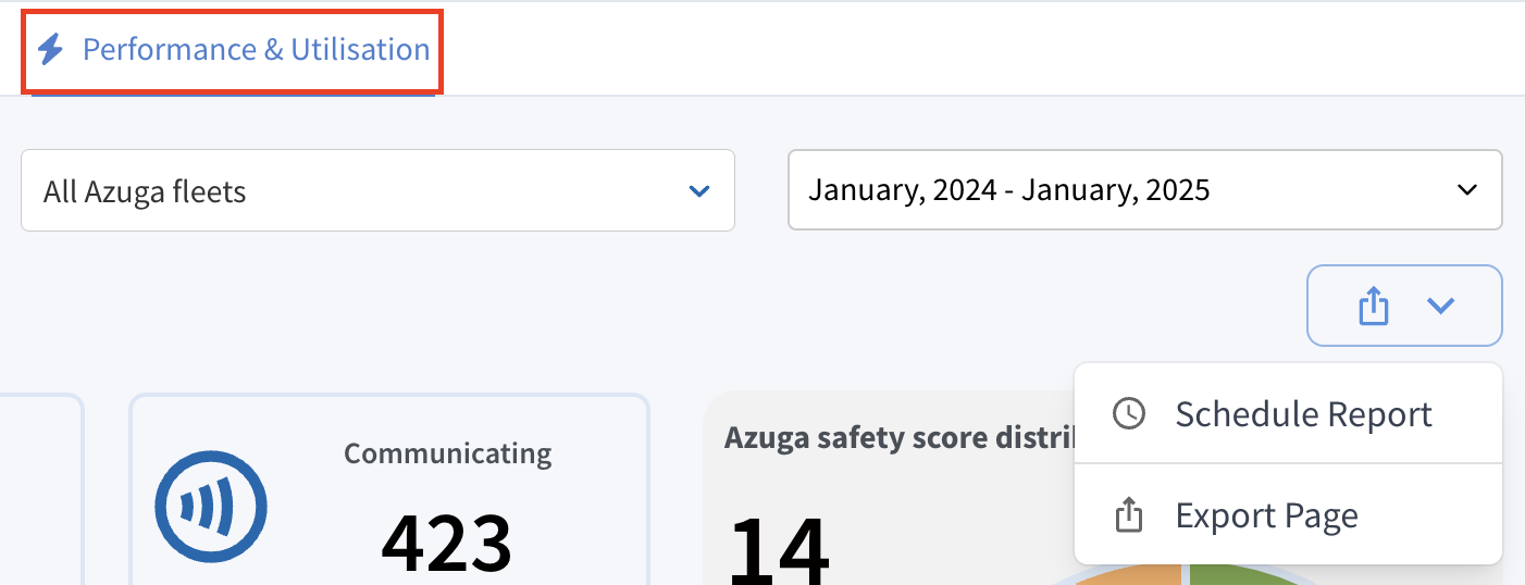
This section provides an overview of device-related performance data specifically for Azuga fleets. This feature enables carriers to monitor device installations and communication statuses through visual charts, detailed tables, and exportable reports.
Note: This feature is enabled only on selected INSCO accounts.
- Grange Insurance
- FCCI Insurance
- Timber Creek
- Cincinnati
- 5Star Specialty Programs
- Great American Insurance Group
- Pennsylvania Lumbermens
- RLI Insurance
- Southern Insurance Underwrites
- Auto Owners
- State Auto
- Ensure analytics
- GAIG
- Church Mutual
- RLI
- Zurich Insurance
The Performance & Utilization module is divided into four key sections:
- Device Portfolio
- Safety Scores
- Relative Trends
- Fleet Engagement
Performance & Utilization – Device Portfolio Dashboard
Device Portfolio
The Device Portfolio dashboard is available across two categories: "All Azuga fleets" and "Specific Azuga fleet".
Customization and Reporting Options:
- Fleet Selector Dropdown: Allows users to filter data by a specific fleet or view data for all fleets combined.
- Date Range Selector: By default, it displays data for the last 12 months on the UI, with options to select a custom date range for analyzing historical performance trends. However, this feature applies only to Azuga Driver Scores, while all other Device-related data reflects current and up-to-date information.
- Schedule Report: Set up a recurring schedule to automatically generate and send Program Dashboard reports on fleet metrics at selected intervals. Reports are sent to recipients on the 5th of every month.
- Export Page: Export the current device portfolio view to save data for offline analysis or sharing.
Device Portfolio
Azuga Device Summary:
Offers a high-level overview of devices across Azuga fleet accounts, highlighting key details such as device count, operational status, and utilization metrics.
Key metrics include:
- Communicating Devices: The number of devices actively communicating with the system.
- Non-Communicating Devices: Devices that are installed but not currently communicating with the system.
- Installed Devices: The total number of installed devices in the fleet, including both communicating and non-communicating devices.
- Not-Installed Devices: Devices that have yet to be installed.
- Total Devices: The total number of devices in the fleet, encompassing both installed and non-installed devices.
Fleet Information:
The Fleet Information section provides essential details about the selected fleet, including its industry, safety performance, and fleet administrator.
Breakdown of subsections:
- SIC Code: Indicates the industry category to which the fleet belongs. This classification helps identify the fleet's primary operations or business area.
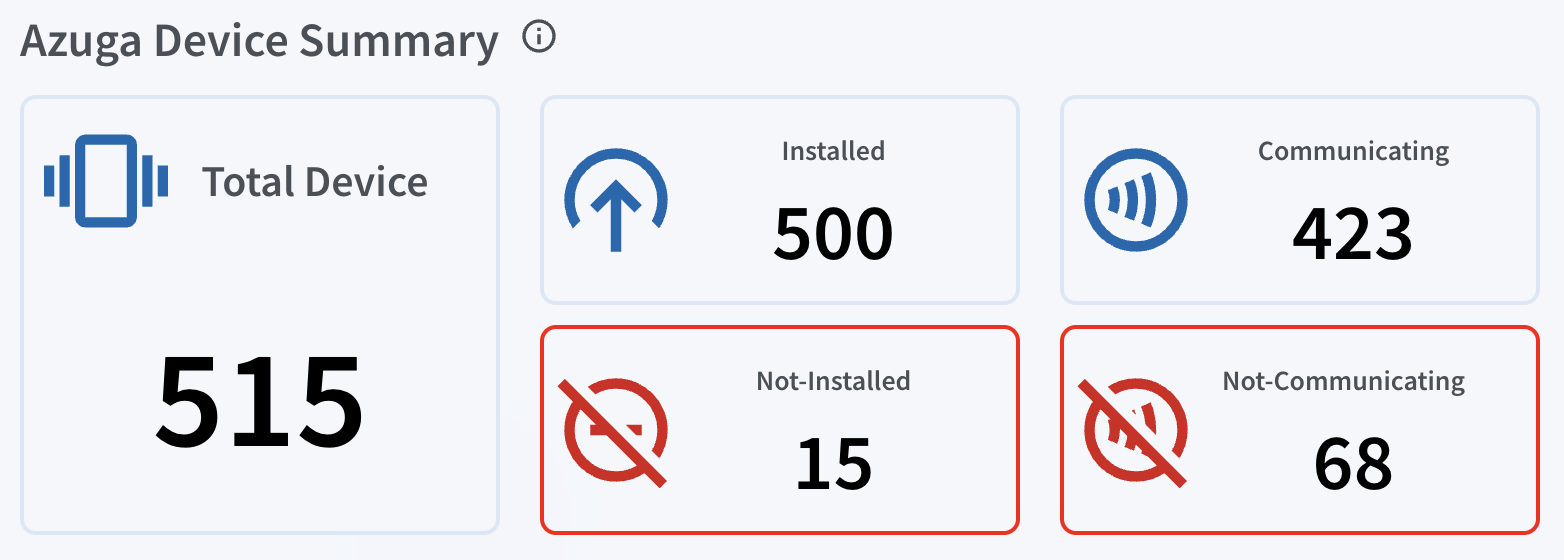
Device Portfolio
- Azuga Safety Score: Reflects the overall safety performance of the fleet based on Azuga’s scoring system. A higher score indicates better safety practices. For instance, a safety score of 89.64 suggests strong adherence to safe driving practices and policies.
- Fleet Admin: Displays the name and contact details of the individual responsible for managing the fleet in the system. A copy icon next to the email address allows users to quickly copy the contact information for easy communication.
Device Installation Distribution:
This section provides a funnel view that displays the total number of devices, installed devices, and communicating devices.
Hovering over each section of the funnel reveals the corresponding values for each category. The first section shows total devices, the second displays installed vs. non-installed devices, and the third presents communicating vs. non-communicating devices with their respective percentages.
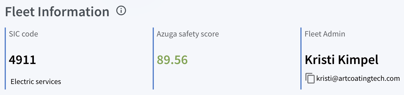
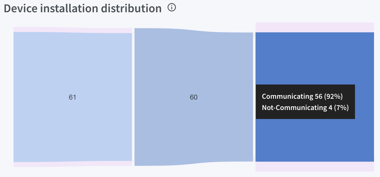
Device Portfolio
Not Communicating Device Distribution:
This section visualizes the distribution of devices that are not communicating, categorized by the reasons for non-communication.
Bar Chart Overview:
- The bars represent communication issue categories in relation to the number of devices in each category.
- The length of each bar indicates the percentage, while hovering over a bar reveals the exact count of devices.
- The bars are uniformly shaded in dark blue for visual consistency, facilitating analysis.
Detailed Device Information:
The information in the data table changes based on the selected filter:
- For All Azuga fleets, this section displays device details across your entire fleet portfolio, including the total cameras, total devices that are installed, communicating, and not communicating.
- For Specific Azuga fleet, it provides detailed device information, such as serial numbers, shipment dates, and activation dates, across fleet accounts.
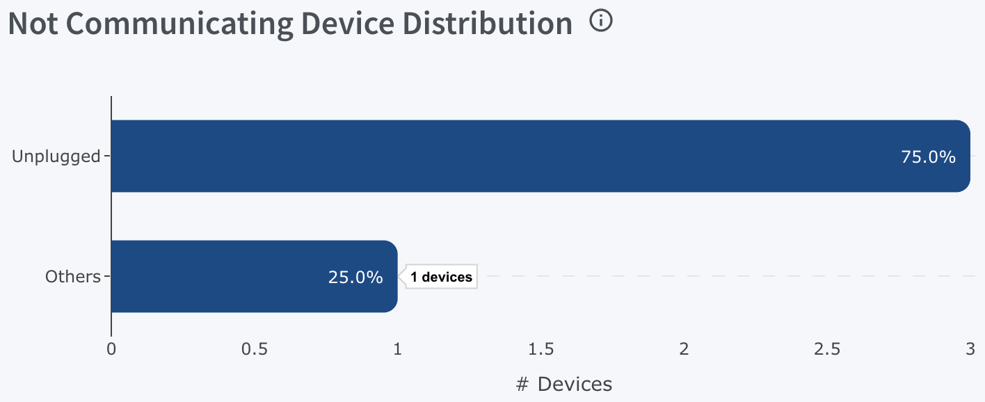
Device Portfolio
This table also Includes:
- Search functionality for quick navigation within the data table.
- Users can export data as a CSV file.
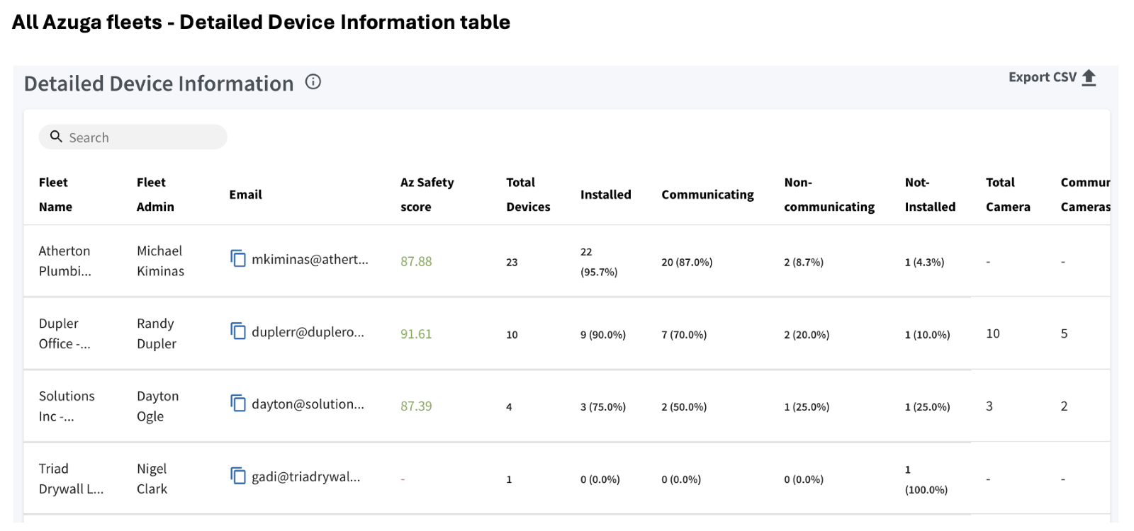
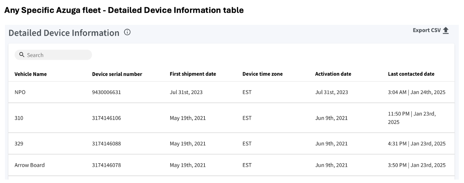
Device Portfolio
Safety Score Distribution:
This feature highlights fleets and drivers categorized as safe, watchlisted, or risky based on driving behavior using Azuga Scores. It monitors 14 fleets, managing 381 vehicles and 340 drivers, with risk distribution clearly displayed in a donut chart.
The safety score serves as a key metric for evaluating driver behavior and overall fleet safety. Hovering over each segment of the chart reveals detailed counts and percentages for each risk level.
The chart divides safety scores into three distinct categories:
- Safe (≥ 75): Represented in green, this category shows the percentage of drivers or vehicles considered safe based on their high safety scores.
- Watchlist (65 ≤ score < 75): Represented in orange, this category highlights drivers or vehicles requiring closer monitoring, as their scores fall within a borderline range.
- Risky (< 65): Represented in red, this category identifies drivers or vehicles with low safety scores, indicating a higher level of risk.
The circular chart provides a visual representation of the score distribution across these categories.
Note:
- A date range filter is available but applies only to Azuga driver scores.
- The remaining Device-related data reflects current and up-to-date information.
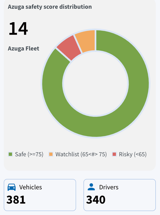
Performance & Utilization – Safety Scores Dashboard
Safety Scores
Introducing the Safety Scores dashboard, which provides Azuga Safety Scores to assess both overall fleet safety and individual vehicle performance across a fleet. This helps insurers evaluate fleet-wide safety trends, identify high-risk vehicles, and improve overall safety management.
Note: The Safety Scores are categorized into "All Azuga Fleets" and "Any Specific Azuga Fleet". By default, the dashboard displays data for "All Azuga Fleets". When a specific fleet is selected using the filter, the data is displayed at the vehicle level
The Safety Scores dashboard is divided into the following key sections:
Safety Score Summary:
The Safety Score Summary for fleet vehicles provides an overall assessment of driver safety, based on factors such as Speeding, Harsh Braking, and adherence to safety policies.
Key metrics include:
- Total Fleets: Displays the number of fleets being monitored in the system.
- Total Vehicles: Represents the total number of vehicles across all fleets.
- Avg. Safety Score: Shows the overall average safety score for all vehicles in the system.
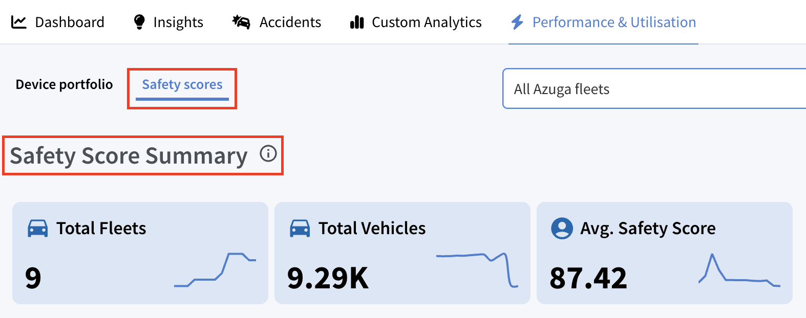
Safety Scores
All Accounts Monthly Trend:
This section contains a bar graph that shows the percentage of accounts in different safety categories for each month.
- Safe (≥ 75) = Shown in Green
- Watchlist (65-75) = Shown in Orange
- Risky (<65) = Shown in Red.
- Other = Shown in Light Blue.
Hovering over a bar reveals the exact fleet count and percentage for each safety category across different months.
When a specific fleet is selected, the monthly trends for all drivers will be displayed as follows:
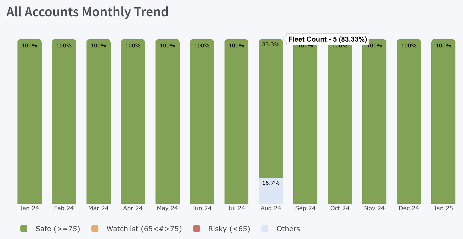
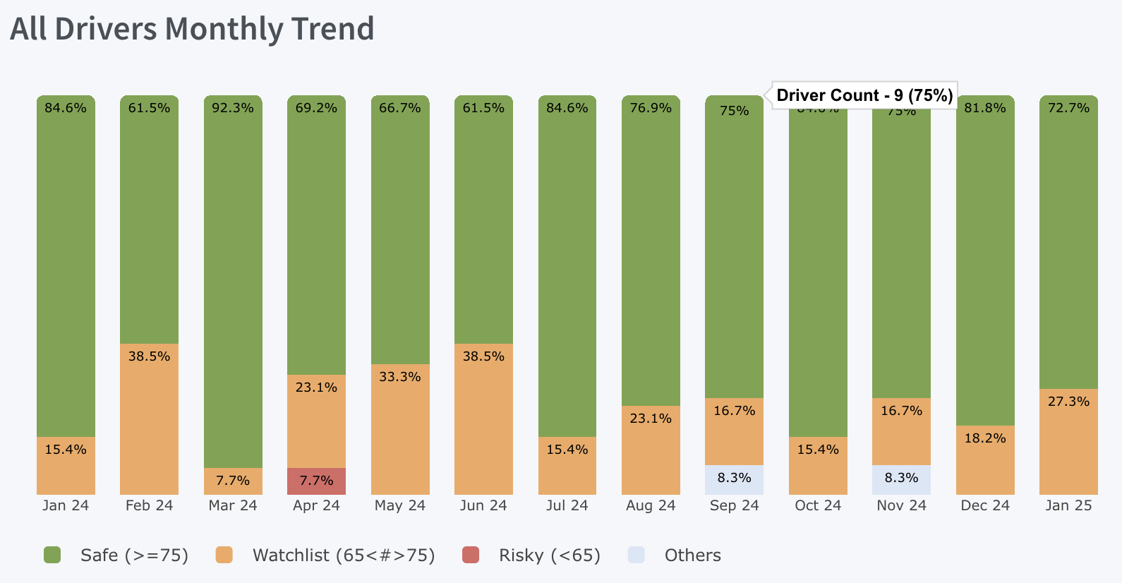
Safety Scores
Top 5 Accounts:
This section displays the five highest-scoring accounts who scored more than 75 along with their respective safety scores. Clicking a bar provides a graphical representation of score variations over time for the selected account.
When a specific fleet is selected, the top five drivers with high safety ratings will be displayed as follows:
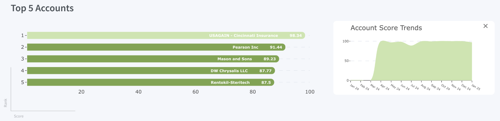
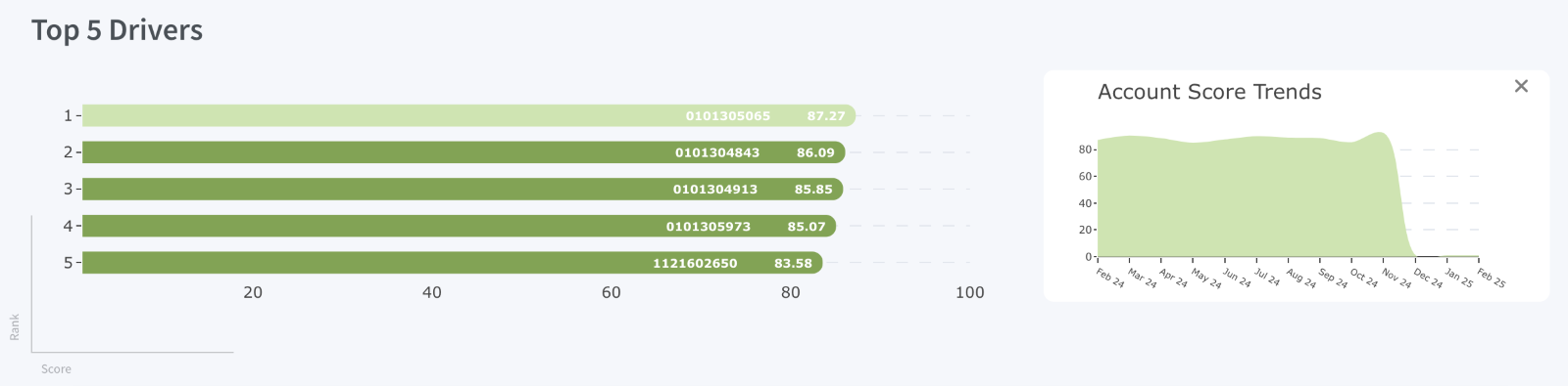
Safety Scores
Watchlist 5 Accounts:
This section displays the 5 highest moderate-risk accounts who scored between 65 and 75 along with their respective safety scores. Clicking a bar provides a graphical representation of score variations over time for the selected account.
When a specific fleet is selected, the top five drivers on the watchlist will be displayed as follows:
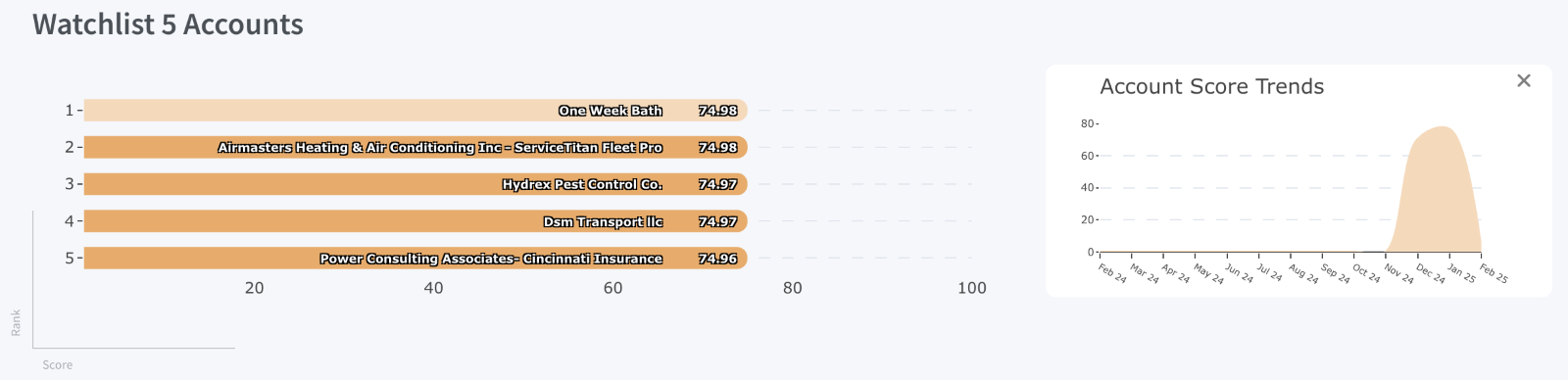
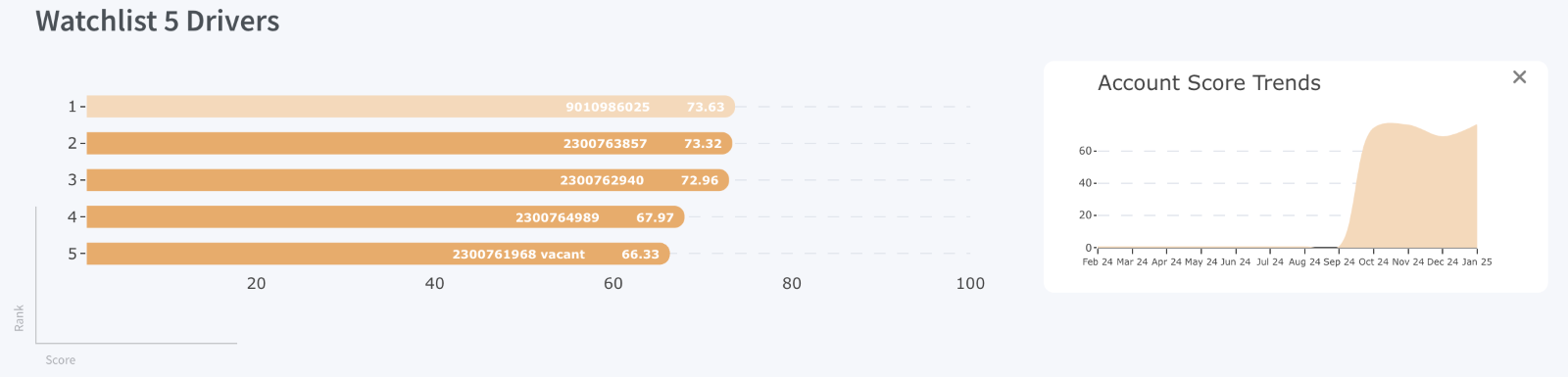
Safety Scores
Bottom 5 Accounts:
This section displays the five lowest scoring accounts who scored below 65 along with their respective safety scores. Clicking a bar provides a graphical representation of score variations over time for the selected account.
When a specific fleet is selected, the bottom five drivers on the watchlist will be displayed as follows:
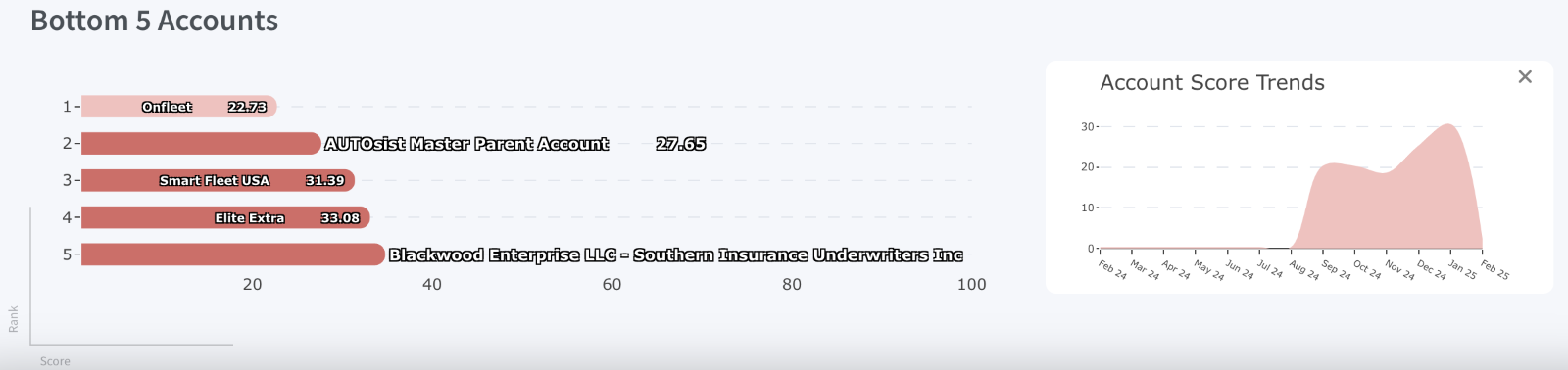
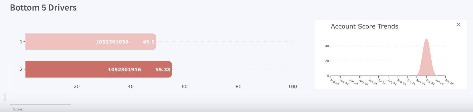
Safety Scores
Azuga Safety Score Distribution:
The Azuga Safety Score Distribution provides a visual breakdown of fleet safety performance, categorized into three distinct groups based on safety scores:
Green
Orange
Red
Safe Fleets (Score ≥ 75): indicating strong adherence to safety protocols and excellent driving behavior.
Risky Fleets (Score < 65): signalling a high-risk performance that requires immediate corrective action.
Watchlist Fleets (65 - 75): require attention and monitoring to improve their safety performance.
It also displays the total number of fleets (9), making it easy to see the distribution of safety performance levels across the Azuga Fleet.
When a specific fleet is selected, the Azuga Safety Score Distribution offers a quick overview of driver safety scores within the fleet.
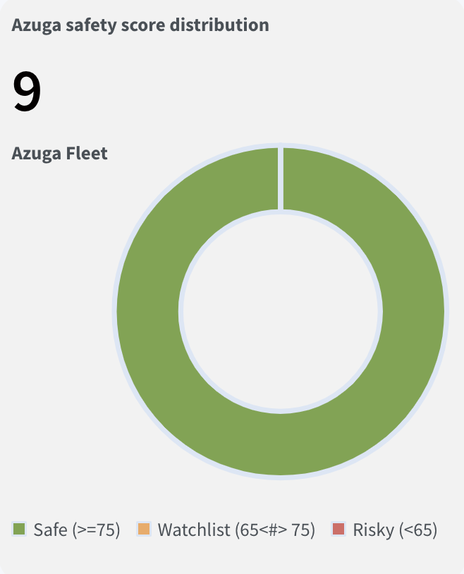
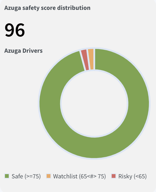
Performance & Utilization – Relative Trends Dashboard
Relative Trends
The Relative Trends dashboard provides a data-driven analysis of Azuga fleet performance over time, helping carriers track improvements or declines in key safety metrics such as Safety Score, Acceleration, Braking, and Speeding.
With this feature, carriers can monitor how their Azuga fleet portfolio has performed over time and identify fleets that are:
- Showing improvements (Upward Trend)
- Maintaining steady performance (Neutral Trend)
- Underperforming (Downward Trend)
Note:
- Relative Trends are categorized into Safety Score, Acceleration, Braking, and Speeding.
- By default, the dashboard displays data for Safety Score Relative Trend. Users can switch between different Relative Trend types, and the dashboard will automatically update to reflect the selected data.
Currently, the Safety Score Relative Trend is the key focus, and the same principles apply to other trend types.
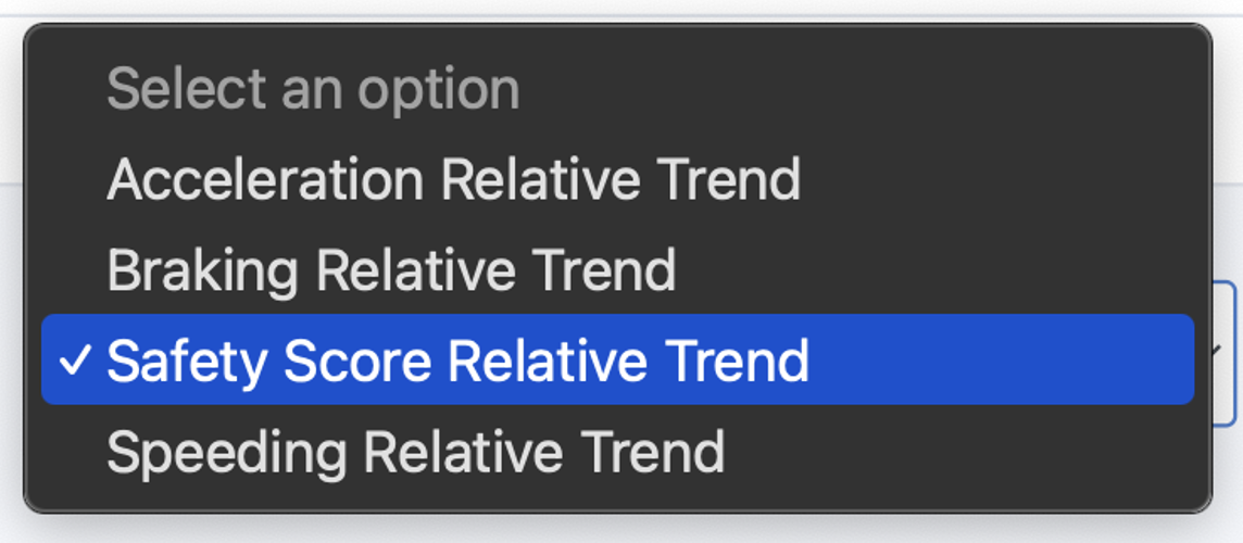
Relative Trends
Dashboard Breakdown :
Safety Score Trend Summary :
Provides a high-level overview of fleet safety trends:
- Upward – Indicates improvement.
- Neutral – Signifies stability.
- Downward – Reflects a decline.
- Insufficient Data – Displayed when there is not enough data available. A minimum of three months of data is required for trend reporting.
Trend Distribution :
This section visually categorizes fleets into four distinct, color-coded groups based on safety performance trends. It displays the total number of Azuga fleets, making it easy to assess fleet-wide safety performance:
Grey
Green
Pink
Orange
Insufficient Data: Fleets lacking enough data to determine a trend.
Upward Trend: Fleets that have improved their safety scores, indicating better driving behavior.
Neutral Trend: Fleets that have shown no significant change.
Downward Trend: Fleets that have seen a decline in safety scores, suggesting deteriorating driving behavior.
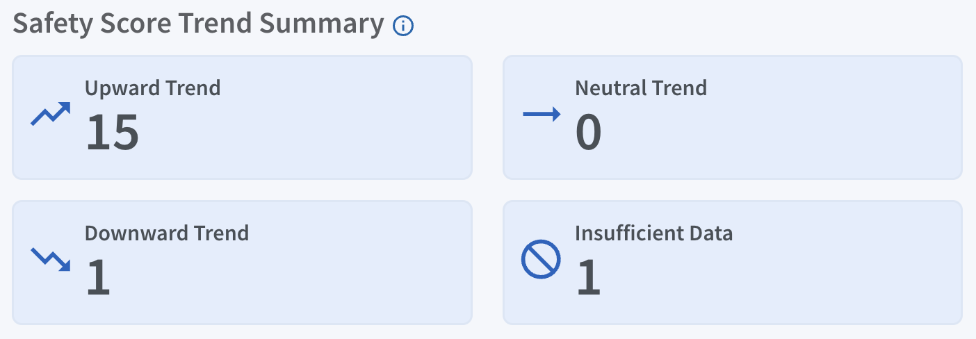
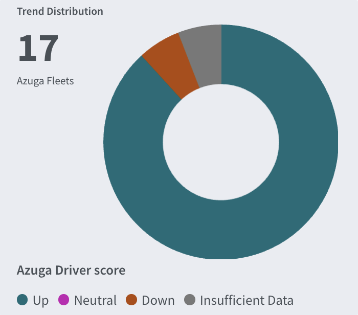
Relative Trends
Azuga Safety Score :
It monitors fleet safety trends over time, assessing improvements using telematics data over relative months of tenure with Azuga. Fleets are grouped based on their time with Azuga, and their performance is analyzed over time to identify trends.
How does Relative Trends work?
Graph Details:
- X-axis: Number of months a fleet has been with Azuga.
- Y-axis: Two values – Number of Fleets and Average Safety Score
For example, Fleet A joined Azuga in January 2025, and Fleet B joined in February 2025. By May 2025, Fleet A has been with Azuga for five months, while Fleet B has been with Azuga for four months.
Their performance is tracked from their first month with Azuga to identify trends over time.
Note: A fleet must complete at least three months with Azuga to be included in trend reporting. Otherwise, it will be classified under “Insufficient Data”.
Relative Trends
As fleet performance fluctuates, the report helps determine whether safety performance is improving over time.
Fleet Details (Upward, Neutral, Downward Trends):
This section lists Fleet names along with their Customer IDs (CIDs) under the Upward, Neutral, and Downward Trends based on their safety score performance over time.
Note:
- Export Functionality: Currently, this module does not support exporting data. However, this feature will be introduced in May.
- Fleet Selection: The option to select specific Azuga fleets will be available starting April.
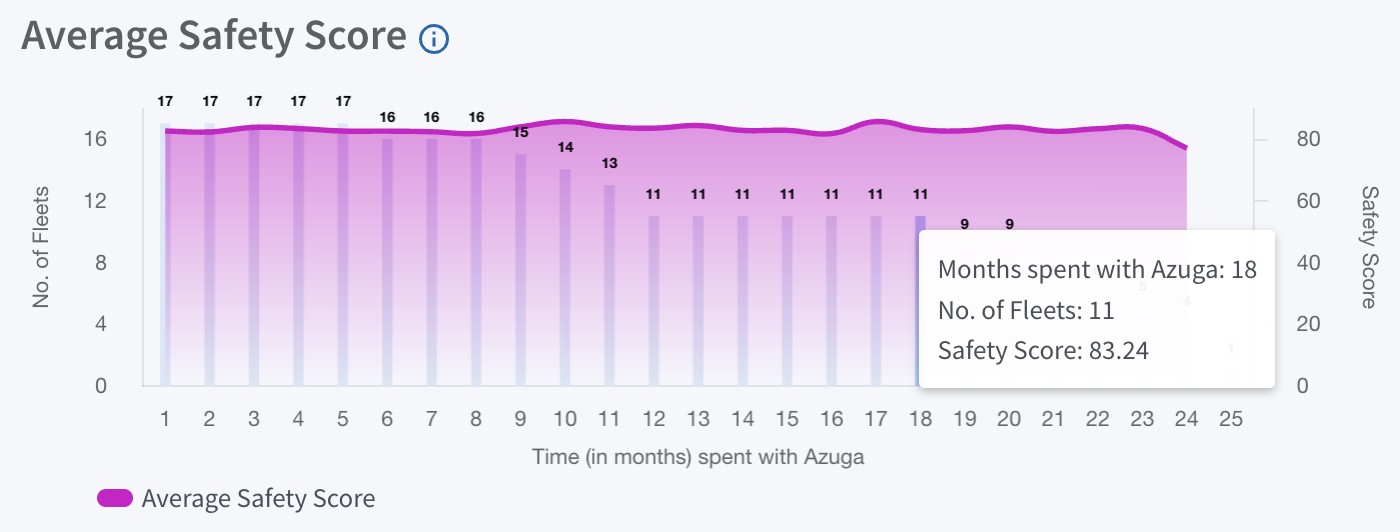
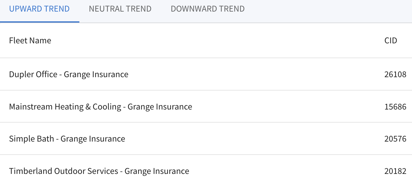
PDF copy of the Document: Fleet Insurance - SafetyIQ - User Guide

Was this article helpful?
That’s Great!
Thank you for your feedback
Sorry! We couldn't be helpful
Thank you for your feedback
Feedback sent
We appreciate your effort and will try to fix the article